Return to Blog
PENTAWARDS TRENDS REPORT 2021-2022
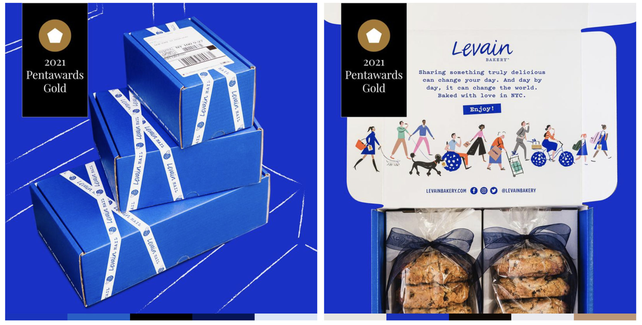
We are honored to have our design for Levain Bakery Ecommerce featured on the Pentawards Trends Report 2021-2022, and to be highlighting the importance of diversity and inclusivity in illustration and packaging design.
For the first time ever, Pentawards released a Trends Report featuring 10 key trends identified from this year’s competitions that will continue to impact and evolve in 2022. There were over 2,000+ entries from 60+ countries. The 2021 entries showed how design can not only help solve crucial issues, both in business and for the planet, but how it can also transform categories, reach new audiences, and bring delight and fun to people’s lives at a time of global uncertainty.
“Together, they reveal the creative zeitgeist of the time, but also give us a glimpse into the future”, says the team at Pentawards.
We highlighted a few of the trends, the full report is available HERE.
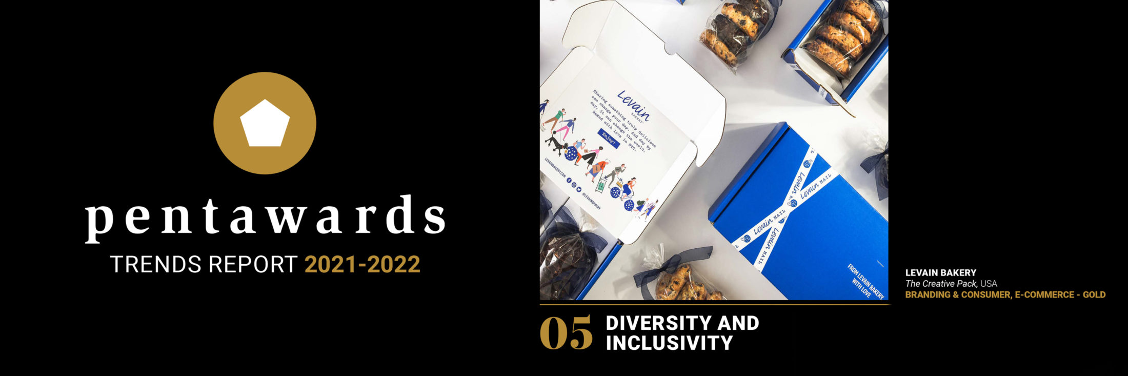
DIVERSITY AND INCLUSIVITY
A trend seen in this year’s winners was packaging highlighting the diversity of individuals across the planet, whether that be based on sexuality, disability, ethnicity, gender or age. Diversity and inclusivity are starting to reach a more sophisticated level with its values and initiatives more embedded in the packaging design, instead of being a token nod.
For Levain Bakery’s e-commerce packaging, the cookie lover’s parade illustration features a variety of characters of different ages, abilities, ethnicities and genders. It presents a more wholesome and inclusive view of NYC, where the bakery is based.
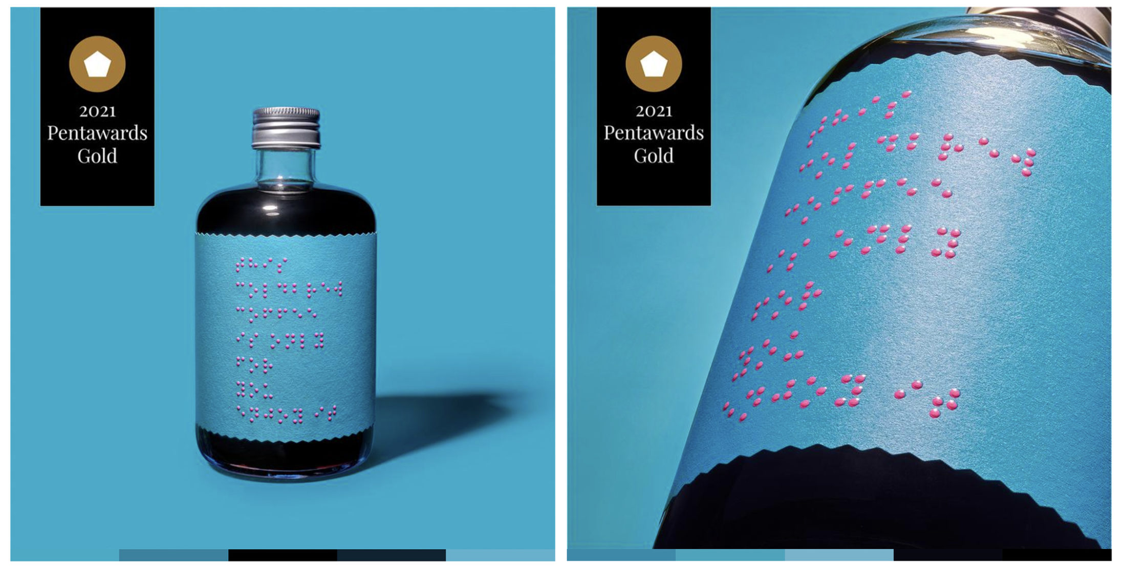
On the other hand, the ready-to-drink coffee brand Only For Your Eyes developed a design exclusively in Braille, creating a packaging that’s more accessible for disabled people, and raises awareness of the millions of blind people in the world.
“Consumers come in varying forms, so recognizing the variety of people across the world is extremely important. Packaging design has that unique ability to help brands reach all types of people, simply by them being included in the creative conception of the packaging” — Paco Adin, Creative Director, Supperstudio, Design Agency of the Year 2021
COLOR AS THE KEY VISUAL
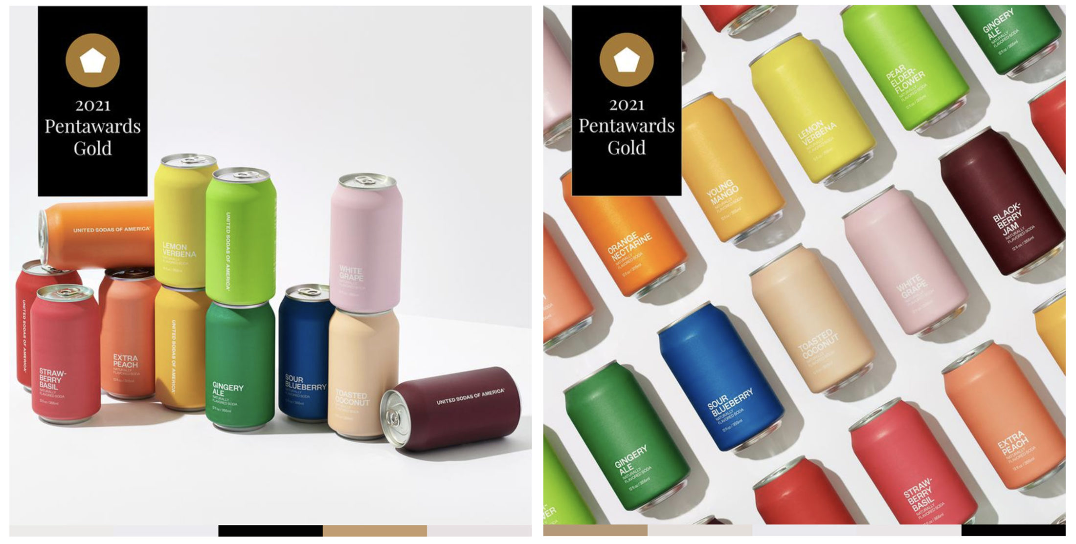
This might have been a way to brighten up consumers’ lives in what has been a hard year for many, there has been a trend for bold color being used as the key visual on packaging – often instead of the product itself or its ingredients. Color is crucial in packaging design (85% of consumers buy products based on color) and that it can have a strong influence on consumer psychology.
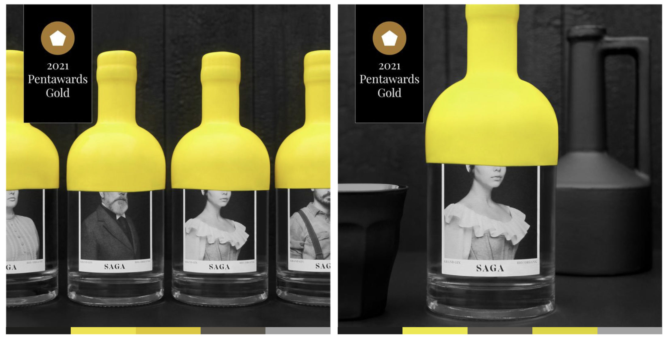
SAGA Gin uses an iconic, extra-large yellow wax seal to make it more distinctive on the shelf while creating a unified look across its packaging. Meanwhile United Sodas of America put color front and center with its daringly minimalist packaging, communicating flavor while showcasing the diversity of its product range.
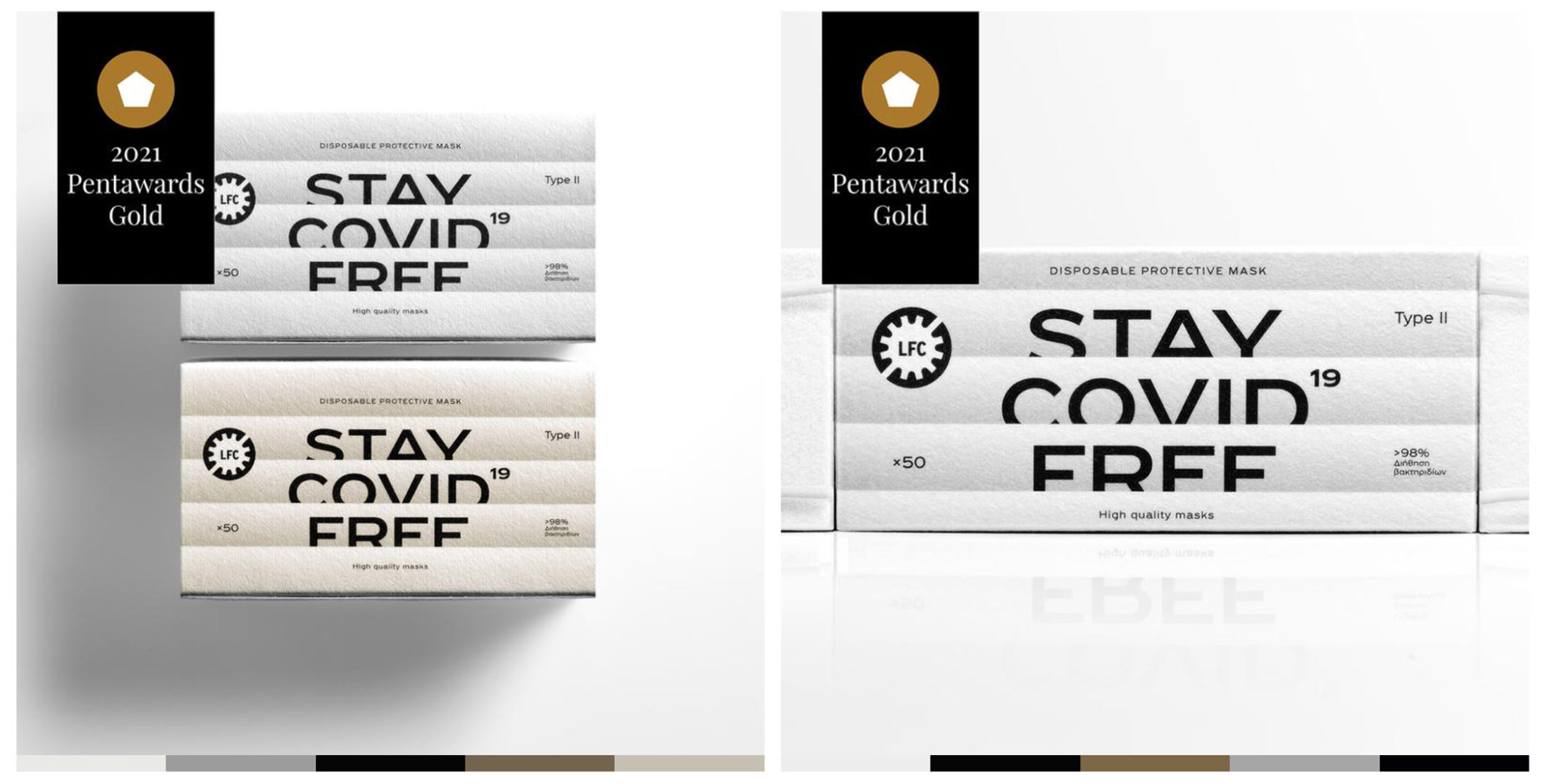
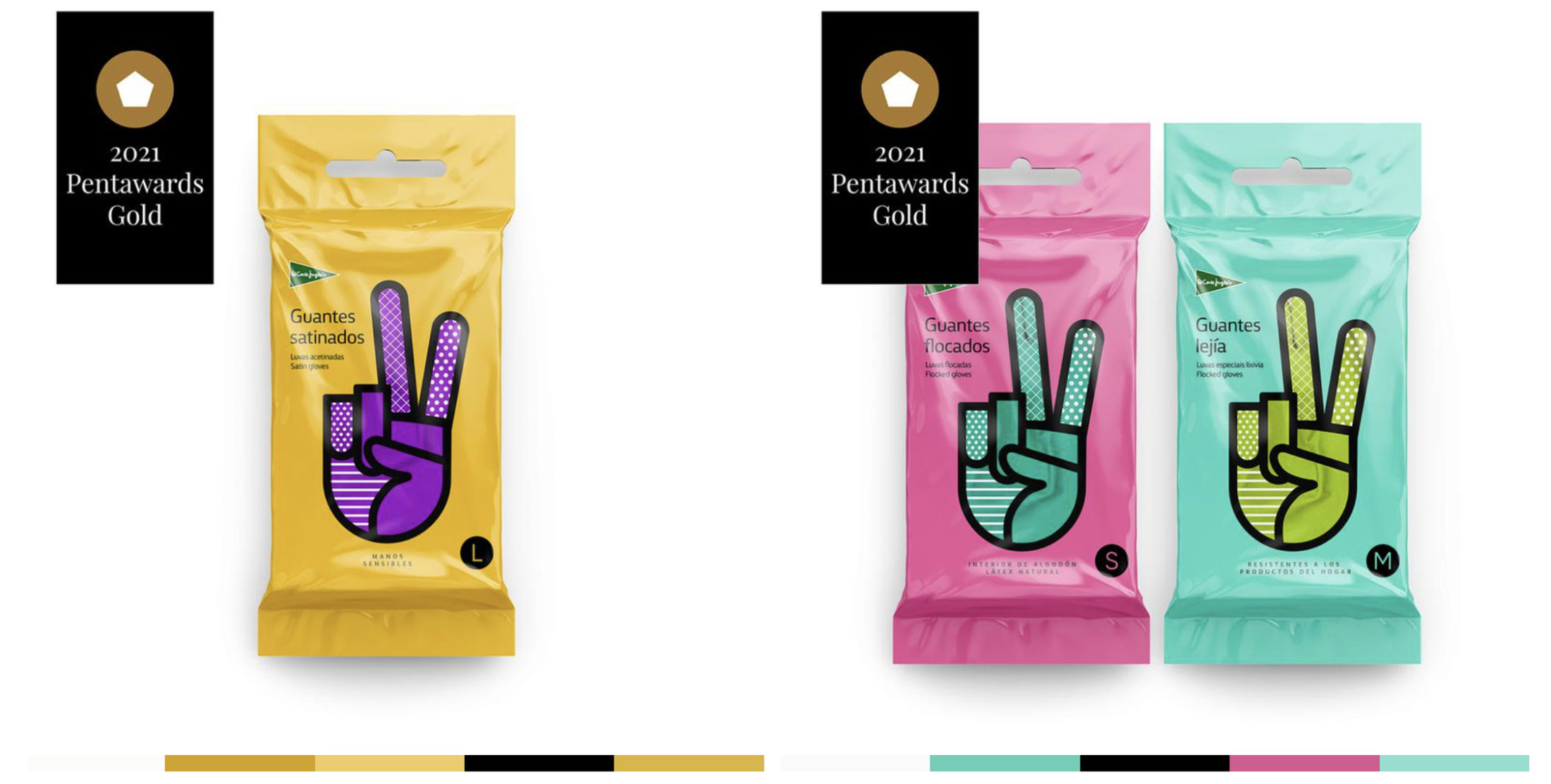
PROTEST AND PROPAGANDA
Packaging design, like any form of art or design, can be a great outlet for communicating societal issues and cultural events, or becoming a symbol of a movement. By choosing to magnify a social imperative rather than a brand name, packaging for Stay Covid Free face masks became a functional messaging tool all in itself, while also highlighting the superior quality of the product.
The packaging for the El Corte Inglés cleaning gloves cleverly uses the peace hand gesture to playfully communicate notions of security, complicity and victory: standing out on the shelves by showing the positive side of household cleaning.
“Packaging design can be a useful communication tool to highlight a brand’s values, and this creative style can really help a brand make a statement” — John Glasgow, Executive Creative Director and Co-Founder, Vault49
HIGHLIGHTING MENTAL HEALTH
Mental Health has always been a sensitive societal issue, with diseases such as depression leading to approximately 700,000 deaths a year, according to the WHO. And it’s no surprise that countries worldwide have seen a rise in mental health diseases since the pandemic. A theme reflected in this year’s entries was around using packaging as a platform to open up conversations around people’s mental wellbeing.
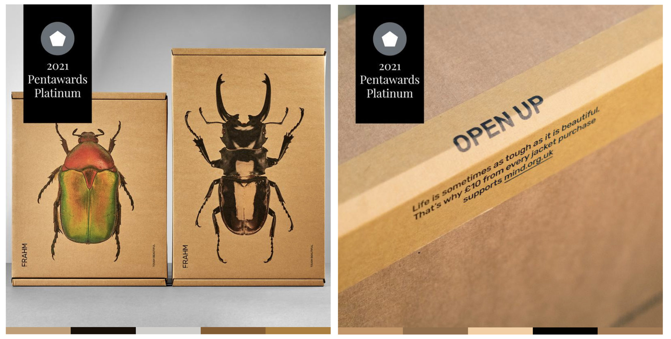
The FRAHM packaging reinforces their Tough Beautiful mantra, using macro shots of UK native beetles – nature’s tough and beautiful little creatures. The packs are closed with bespoke packaging tape that has an ‘Open Up’ message, highlighting that money from each purchase is sent to a mental health charity.
“As we reflect on the post pandemic world, it’s important that we realize the importance of mental health within the design community and the wider world. Raising awareness of mental health is vitally important, making it less taboo” — Clem Halpin, Design Lead, Taxi Studio and President of the Jury, Pentawards
PENTAWARDS
Founded in 2007, Pentawards is committed to recognizing excellence in design, providing a source of inspiration and connecting the global packaging community through its annual design competition. Since its launch, the competition has received over 20,000 entries from over 64 countries, and its winners have presented some of the most innovative, inspiring and powerful packaging designs in the world.
For the full report – CLICK HERE.