Return to Blog
Earth Fare Crackers


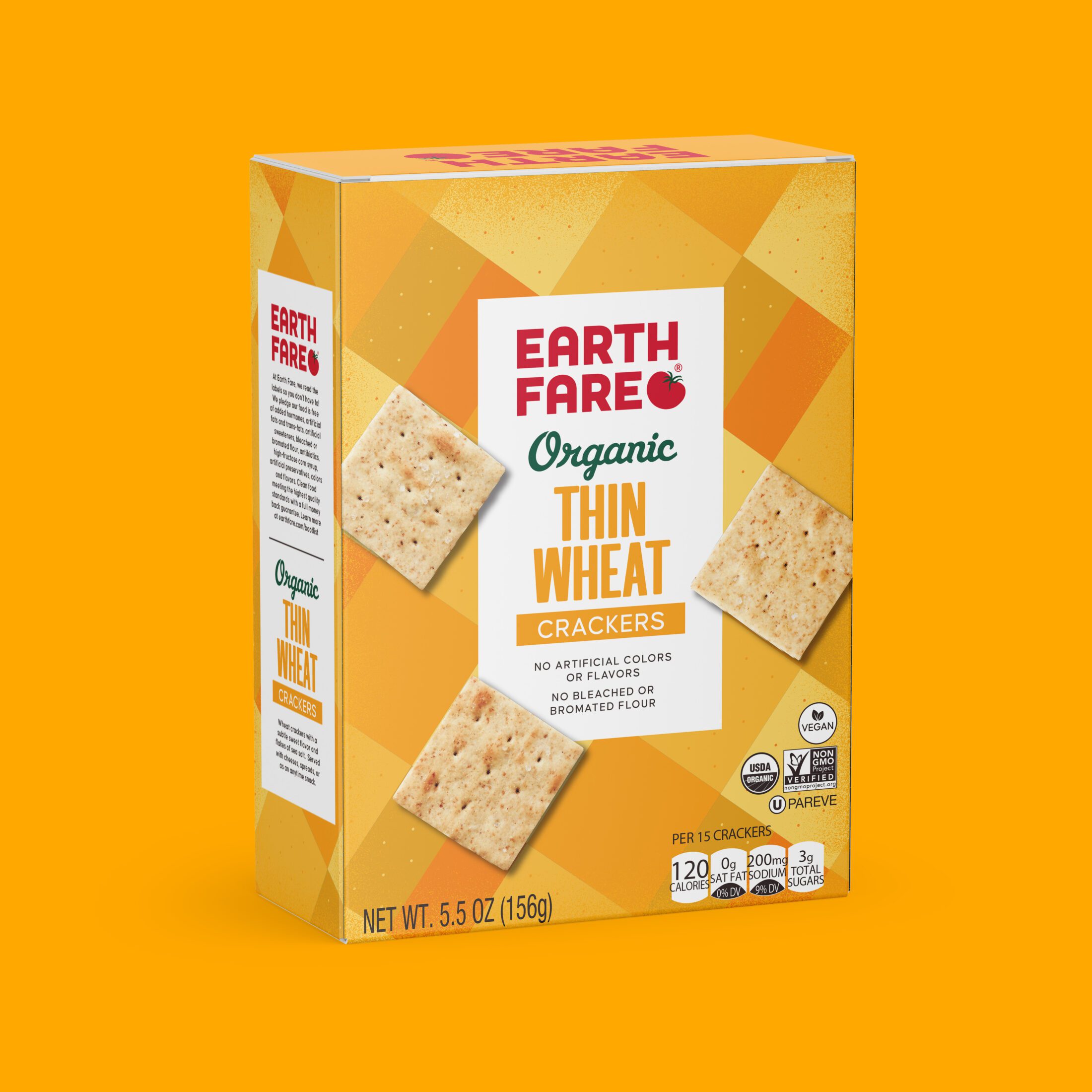
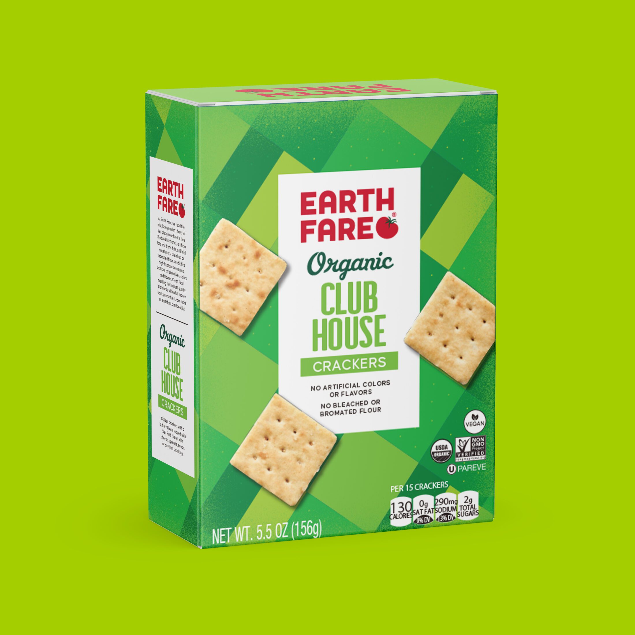
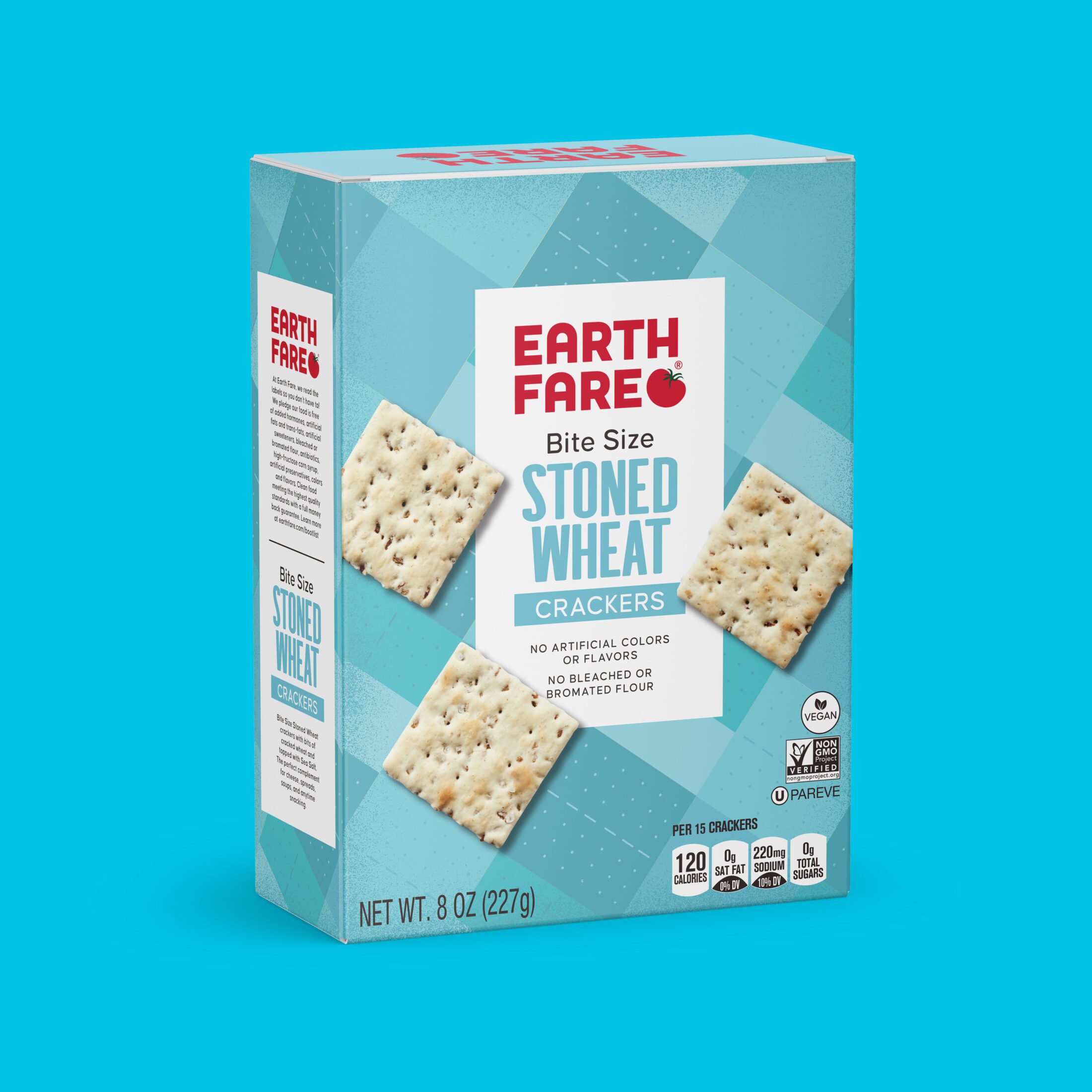
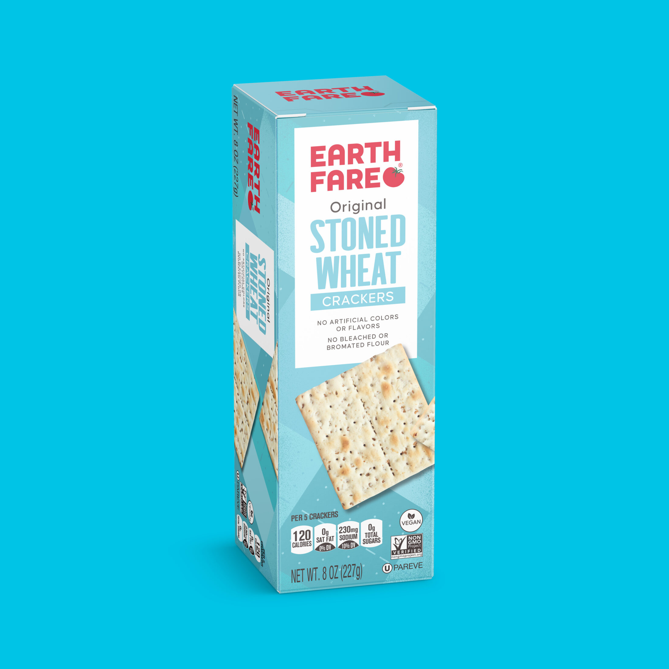
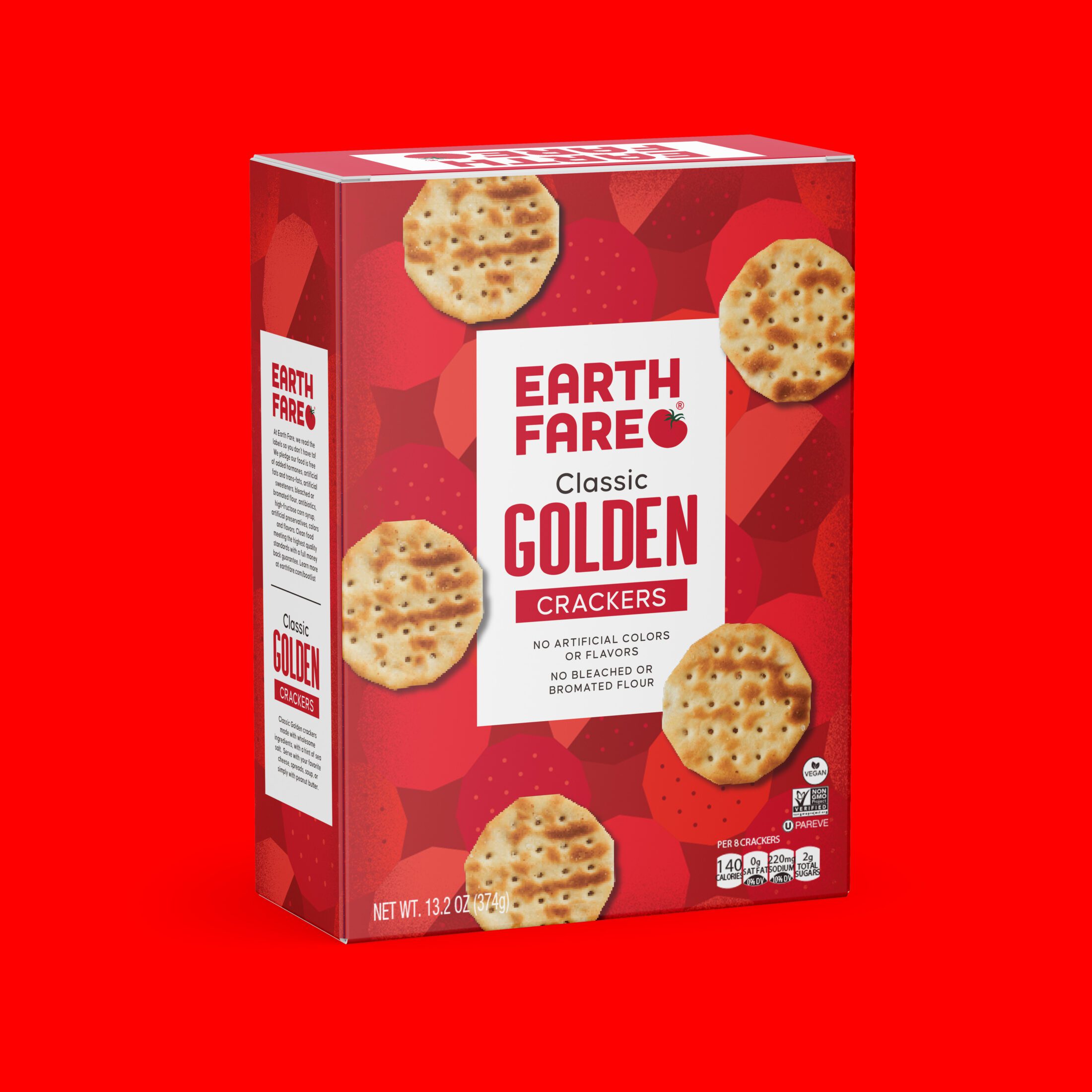
The Earth Fare Crackers design takes a rather basic staple and turns it into a shelf standout, that feels exciting and fun. The bold color palette and graphic pattering, all inspired by the crackers themselves, are the defining features. While from far away the pattern can look like simple color blocking, when up close there is detailing within the shapes that mimic the crackers’ individual details. Photography of the crackers are strategically placed to align with the pattern below. Becoming harmonious with the pattern. This design for Earth Fare fits nicely into the current private label branding while still being distinct in the overall line up of products.

