Return to Blog
The Creative Pack Designs Sleek, Sophisticated Protein Powder for Fresh Thyme
The Creative Pack worked closely with Fresh Thyme to create a bold design to highlight the new Bone Broth Protein Powder, the newest addition to the Fresh Thyme’s Protein Powders range. The design needed to differentiate bone broth as a unique kind of protein powder, but also resonate with the existing range of plant and whey protein powders to create a cohesive look that also aligned itself with fitness, nutrition and wellness world.
The Brief
• Determine what consumers want to know about bone broth protein powder – its nutritional value compared to that of whey and plant proteins
• Translate the Fresh Thyme branding into a fitness, nutrition and wellness design
• Translate the protein powder design into a bone broth protein powder design
• Create a new color system for the bone broth design and for the flavors within the range
• Communicate the products functions and ingredients
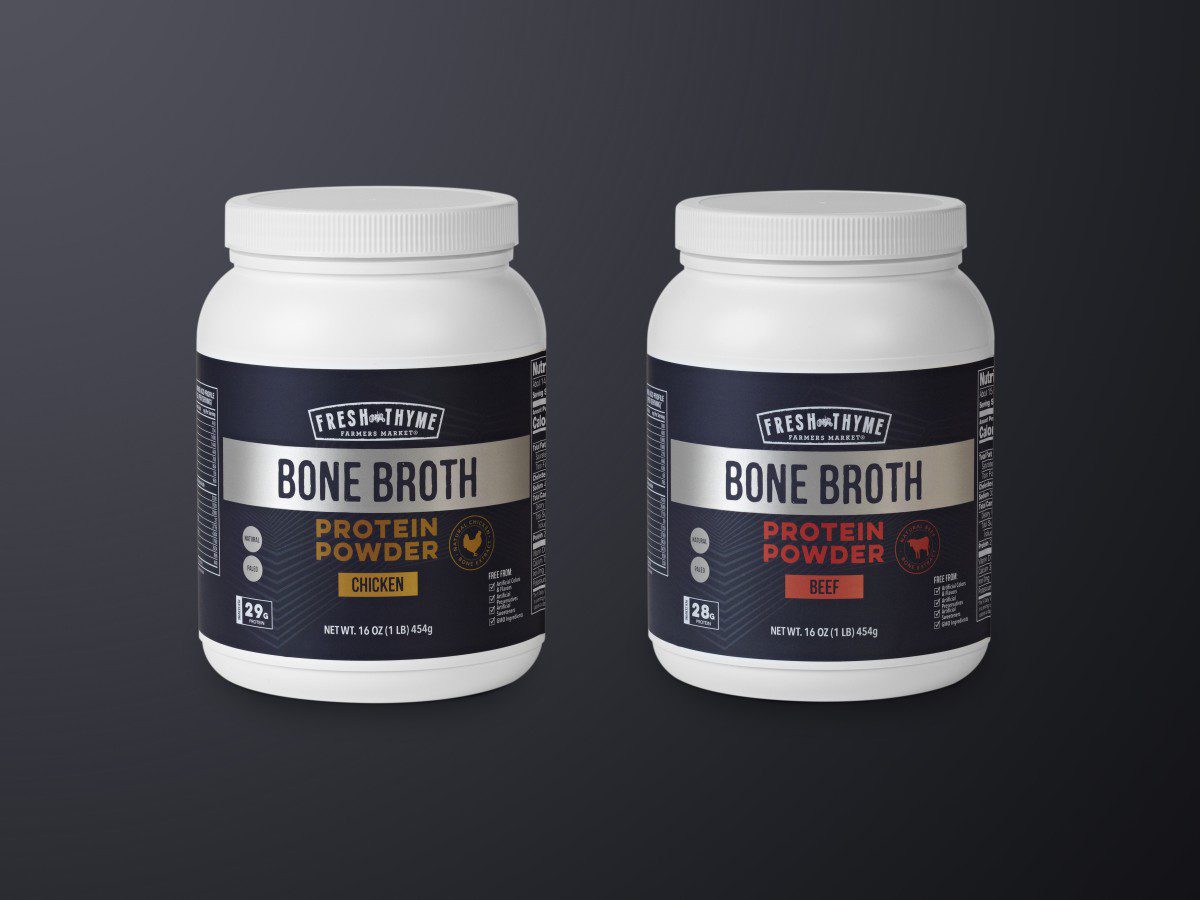
Like in the existing protein powder range, the bone broth protein powder removed the Fresh Thyme tractor horizon, color-coding system, font styles and illustrations. The design needed to resonate more closely with the functions and ingredients of the product – a sleek, bold and sporty look. While the usual Fresh Thyme font used for the product title, a heavy weight san serif font was introduced as a sub font. This font was used for flavor titles (chicken or beef) as well as the nutrition information. A new nutrition callout system was created to emphasize the health benefits. Each call out was placed in a circle – bold and simple.
What makes the Bone Broth Protein Powder distinct is its bolder darker look. The label was made matte black with a slight off black metallic pattern – a sophisticated moody look for the serious protein buff who wants a natural alternative protein. The subtle patterned background allowed the information on the packaging to really stand out. The logo was simplified into a white one-color logo, which instantly made the design cleaner and more refined. To give the packaging a sportier, sleek look, a metallic color palate was implemented. The metallic embellishments add a nice contrast from the matte black background and allow those details to really pop.
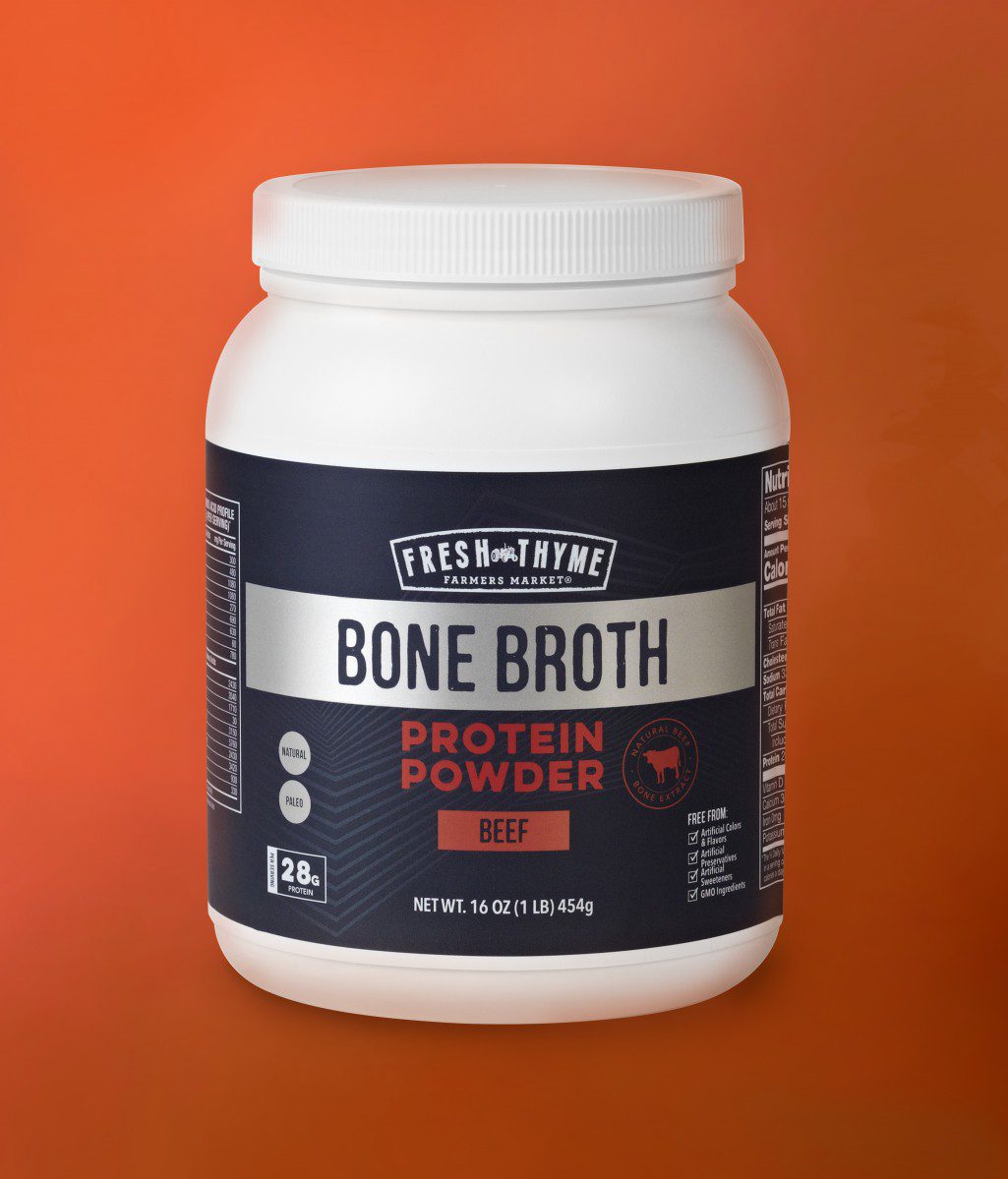
It was very important to make a clear distinction between the two types of protein powder – chicken and beef. A flavor color-coding system of either gold or red was implemented for customers to easily differentiate the two. Also a chicken or beef emblem was stamped on the right side of the flavor title as another detail to highlight the flavor.
The Fresh Thyme Bone Broth Protein Powder range design maintains a look reminiscent of the other protein powders but with a personality all it’s own that appeals to the ultra health and fitness customer. The design is bold, sophisticated with a sporty spin. This unique product has a design to match that will intrigue customers and stand out on shelf.
Download the press release here.
