Return to Blog
The Creative Pack Designs Bold & Vibrant Fresh Thyme Organic Premium Spice Range
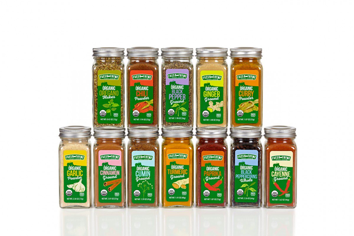
We are super excited to share a new project that we designed with our client Fresh Thyme. As part of their private label brand the midwest grocery food retailer asked us to design its organic premium spice range. A range Fresh Thyme really wanted to stand out not only from other spice ranges on the shelves, but also from other of its private label products.
Our objectives for the project included –
– To design, a range that fits within the Fresh Thyme design while recognizing this line as premium and organic
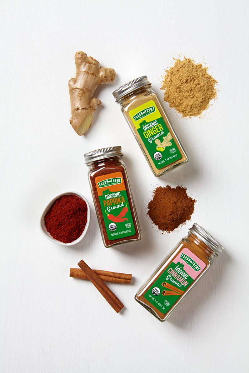
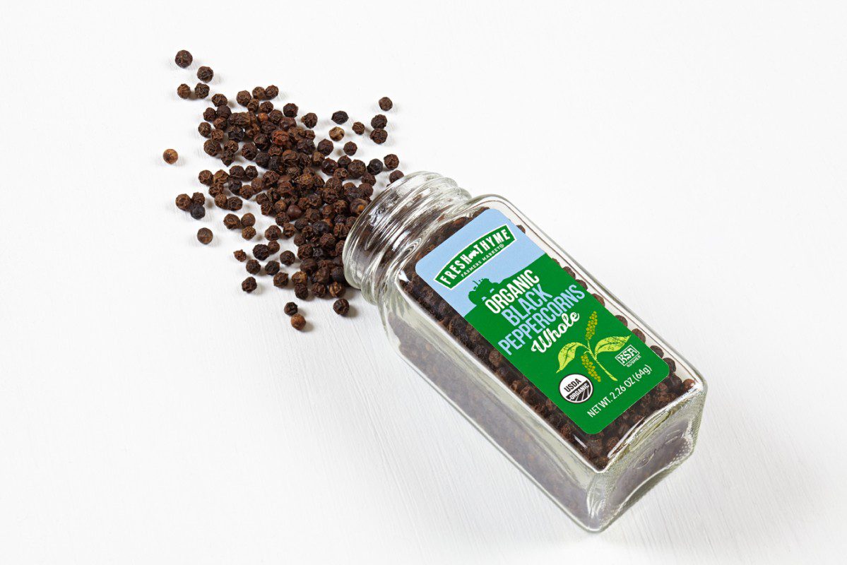
– To draw custom illustrations for each of the 12 spice SKUs taht clearly communicates product without the need to add text
– To determine appropriate colors to differentiate the psices complimenting the spice color inside
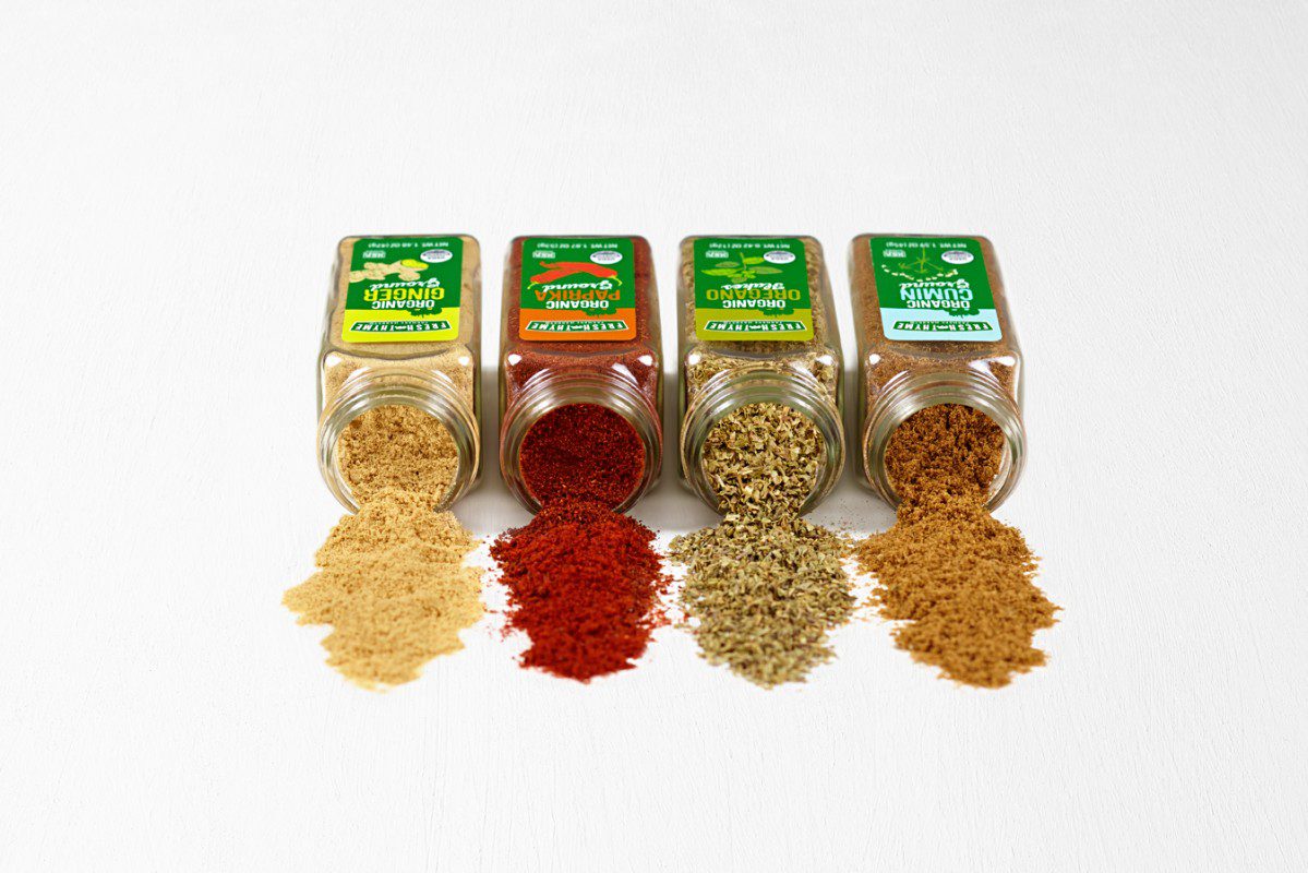
To customize the spice range, we created unique illustrations of the key ingredients in each of the spices clearly communicating the product inside. The handcrafted imperfect illustration style communicates the farm fresh quality that Fresh Thyme achieves. The color-coding was determined by what best complemented the illustrations, the green horizon line and product inside. While other spice packages opt for a more natural earthy muted palette emulating the color scheme of the spices, Fresh Thyme’s range is bold and vibrant.
On shelf the Fresh Thyme organic spices are easily recognizable and really draws in the customer’s eye. This range is able to communicate the organic natural product with the heavy use of green seen on the tractor horizon and Fresh Thyme logo. In the title the word “organic” is emphasized in white. The spice bottles are glass and the metallic silver caps elevate the range.
This line embodies “the new natural.” It is a modern playful take on health and good quality.
 You can download the press release here.