Return to Blog
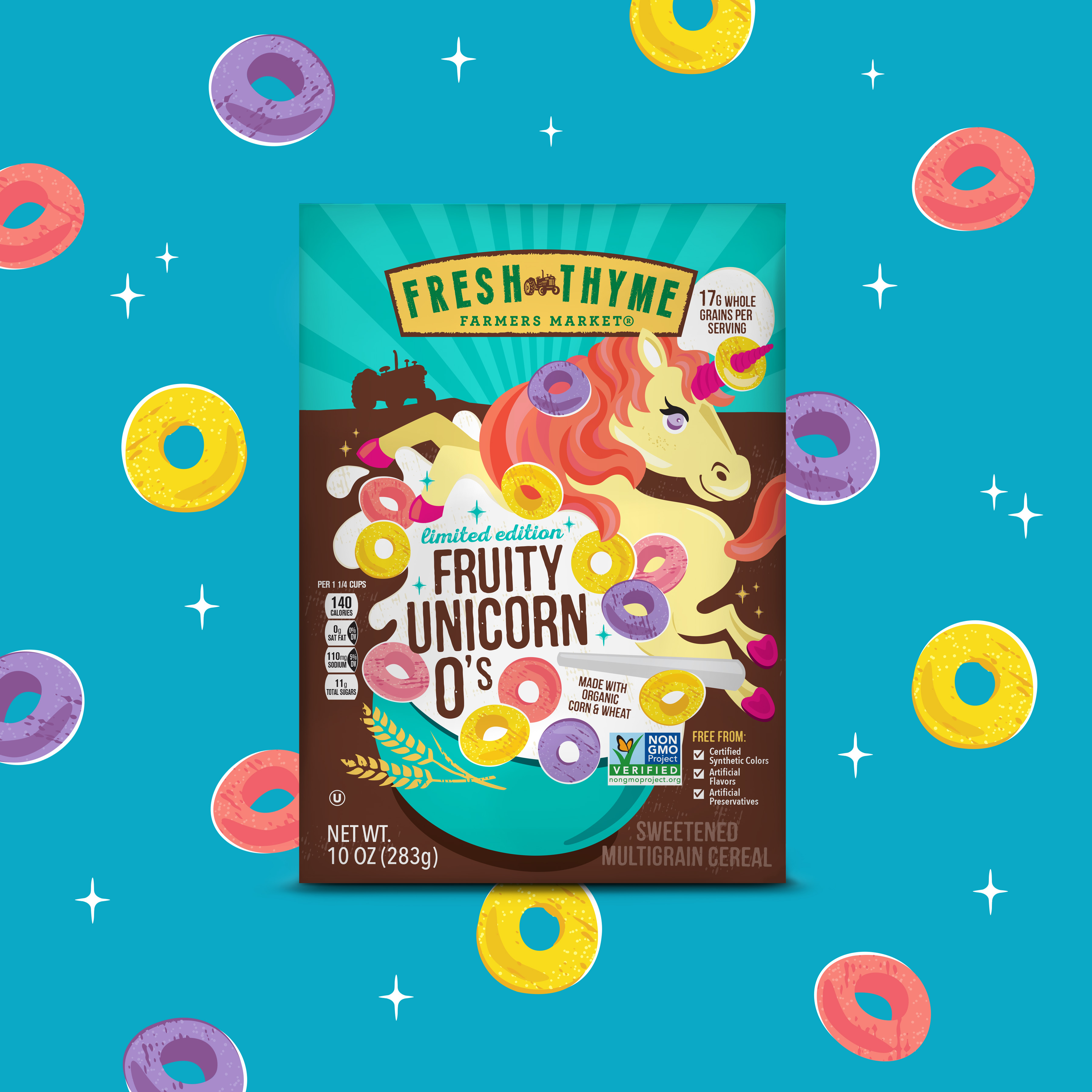
The Creative Pack Design Playful and Fun Rainbow Unicorn Cereal for Fresh Thyme
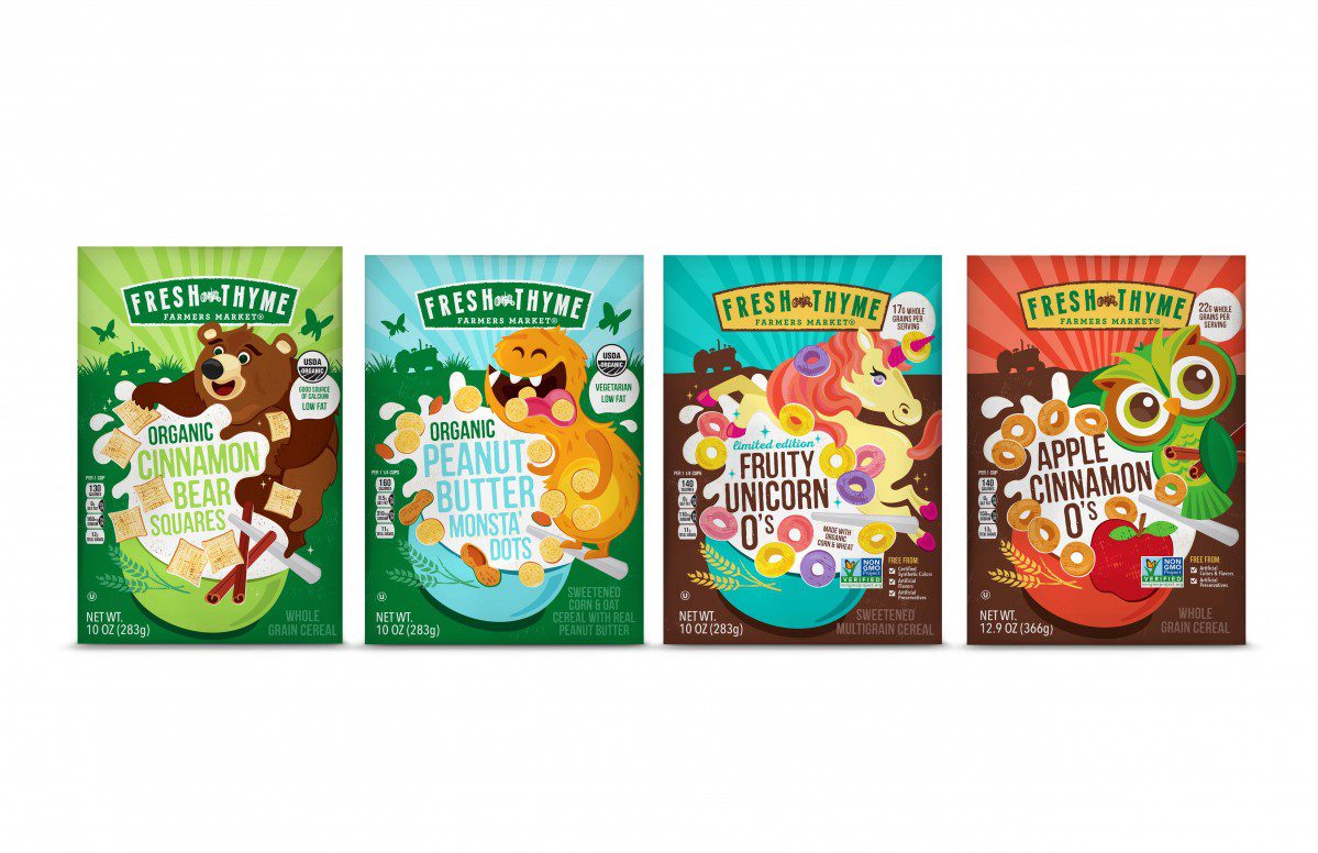
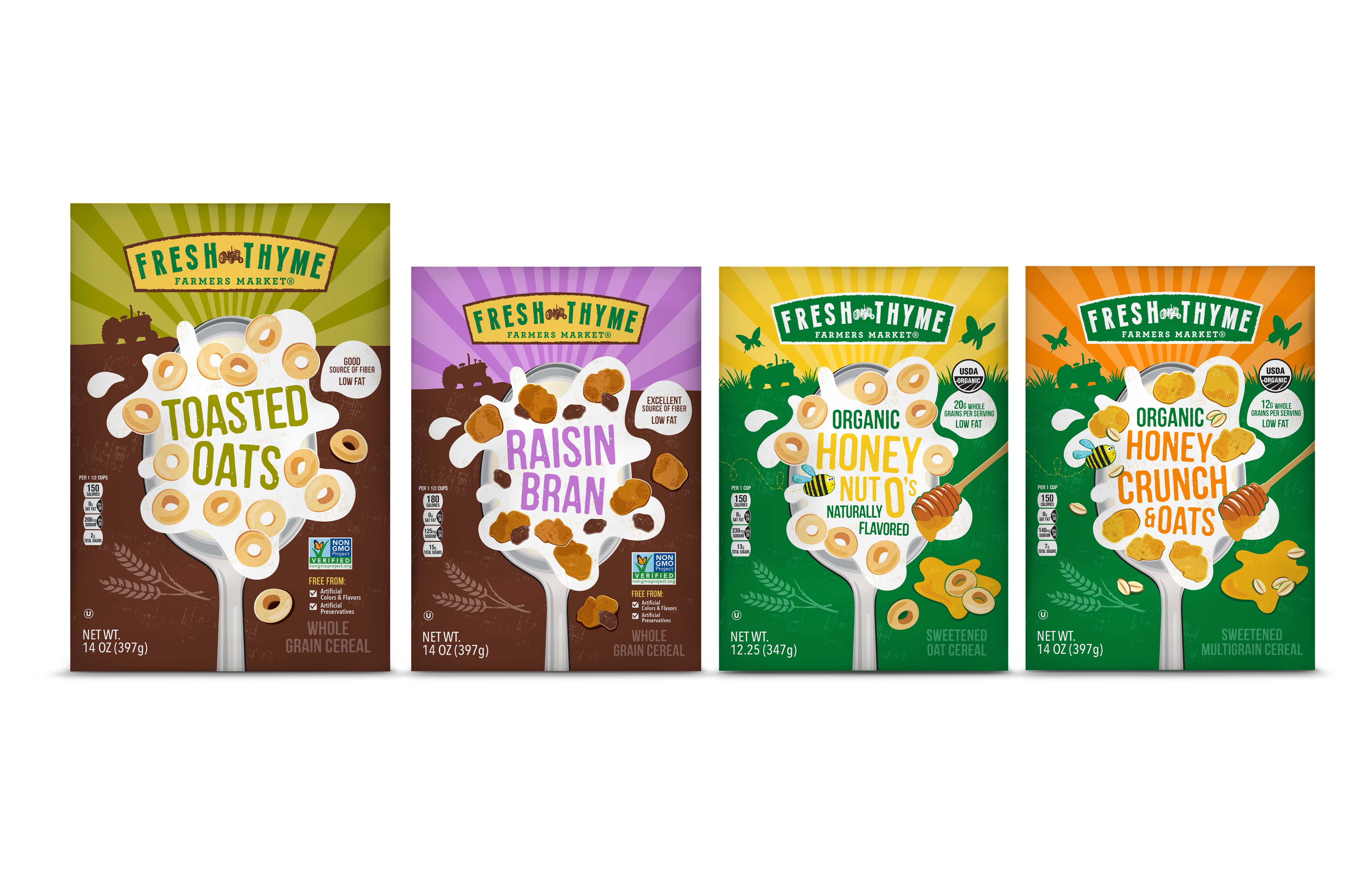
As part of the 1000+ SKU private label program, Fresh Thyme asked us to create a design for a new range of 8 cereals. This staple product is Non-GMO made in both the natural and organic range for kids & adults.
To set Fresh Thyme cereal apart from branded competitors, we designed the boxes with a bold graphic style while maintaining the Fresh Thyme look. Never done before, the unique characters and bold illustrations set Thyme Fresh cereal apart on the shelf.

The Brief
– Maintain Fresh Thyme brand
– Create unique illustrations that capture the cereal
– Design bold graphics that stand out alongside other Fresh Thyme products
– Compose a cohesive line that translates for kids & adults
The process began with determining how to translate the existing Fresh Thyme design into a cereal range that engages with kids and adults. The Creative Pack asked themselves: “What design components should remain the same and what should be changed or added to enhance this line?” In 2018, The Creative Pack was able to successfully create a range with bold illustrations that merchandise well on shelf while maintaining the Fresh Thyme branding.

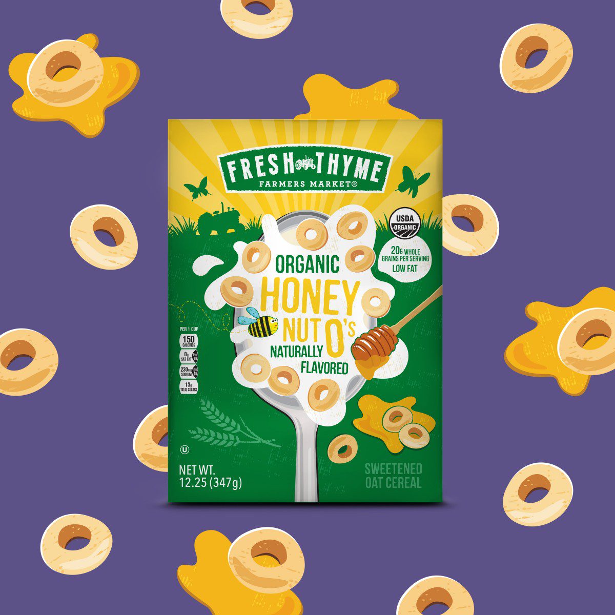
To maintain brand recognition the Fresh Thyme’s farm horizon, their iconic tractor, a color-coded sky that coordinates with the bold product title, and fun handcrafted 2D illustrations were all kept on the packaging. These bold elements distinguish Fresh Thyme’s line from other brands on the shelf and embody who Fresh Thyme is. The line truly has a unique identity unlike any other private label.
Though each product maintains these basic design elements, each product is given its own spin inspired by the products’ characteristics. The Creative Pack’s aim was to capture the nature of the product and excite Fresh Thyme consumers, creating products that really sell. The bold illustration component of the design truly helps in making the brand unique and recognizable. Illustrating the cereals versus photographically capturing them really differentiates the line – an execution done by very little.

Each box has its own exclusive graphic that caters to the cereals’ ingredients, name and demographics. To attract Fresh Thyme consumers, The Creative Pack incorporated bold and unique illustrations. These oversized graphics demand attention. With children in mind, The Creative Pack designed fun and age appropriate characters to peek their youthful and curious imaginations; ranging from Peanut Monsters to Rainbow Unicorns, the designs are fun and full of life. While adults may too find themselves buying these boxes with enchanting creatures and furry friends, a separate look was designed with an oversized spoon illustration and the cereal splashing around it. With adults in mind, the illustration focuses on the actual cereals and their ingredients. Large in size, this graphic catches consumers’ eyes and pockets with its interactive design – milk splatters, buzzing bees and off-centered text.

These dynamic illustrations all different in design remain cohesive and reminiscent of the Fresh Thyme’s core private label design, with a similar structure and strength, but a personality all it’s own. The design is bold, energetic, fun and refreshing that makes the range really pop on shelf and compete with competitor brands.
Download our case study here.
