Return to Blog
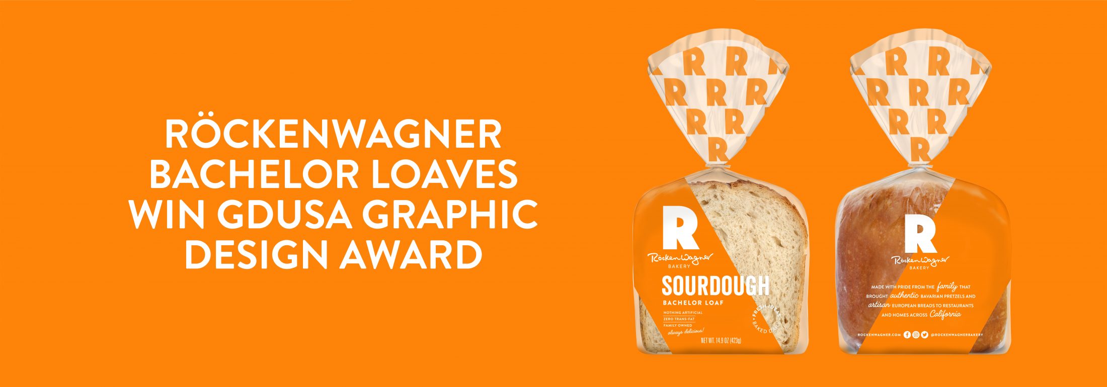
Rockenwagner Bachelor Loaves Win a GDUSA Graphic Design Award
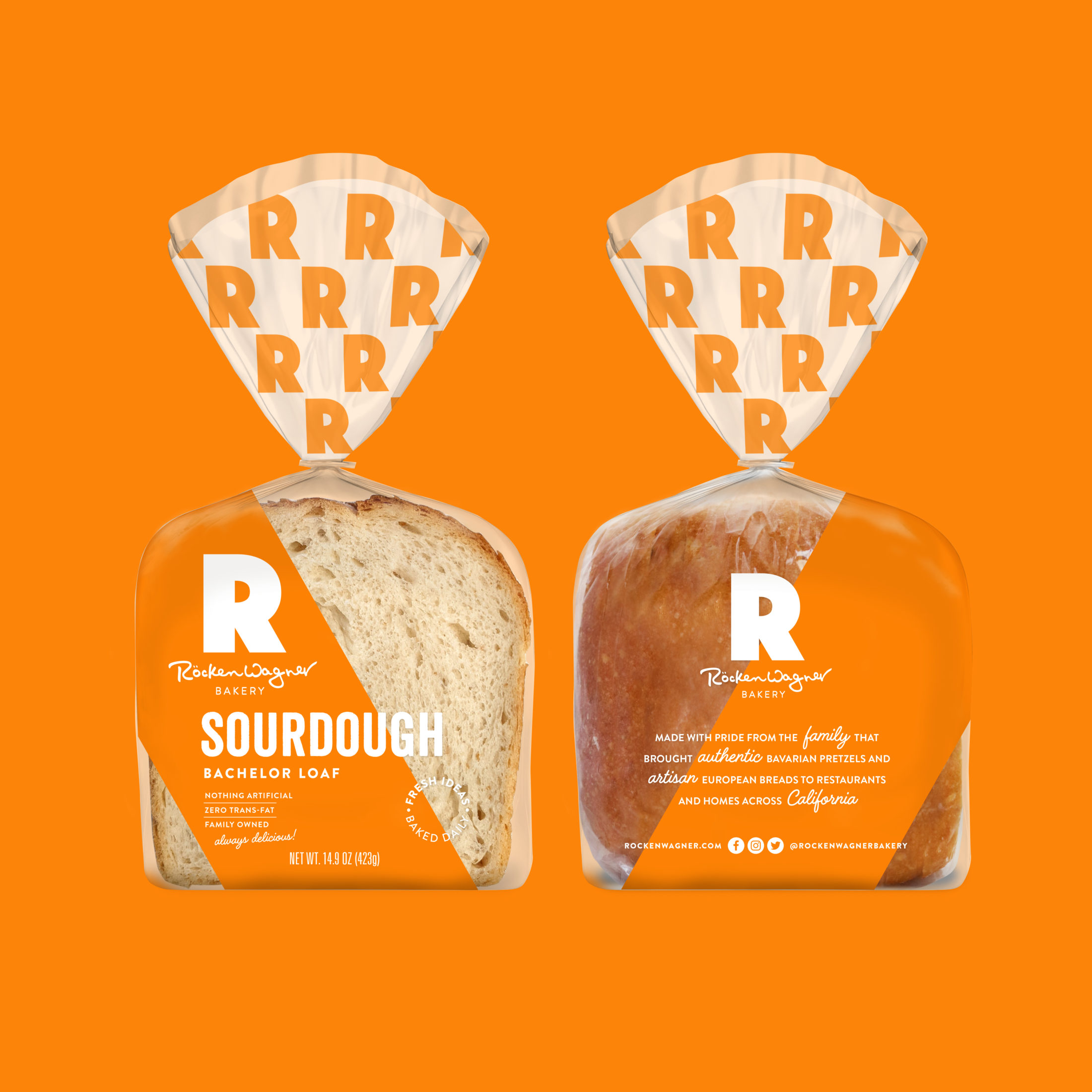
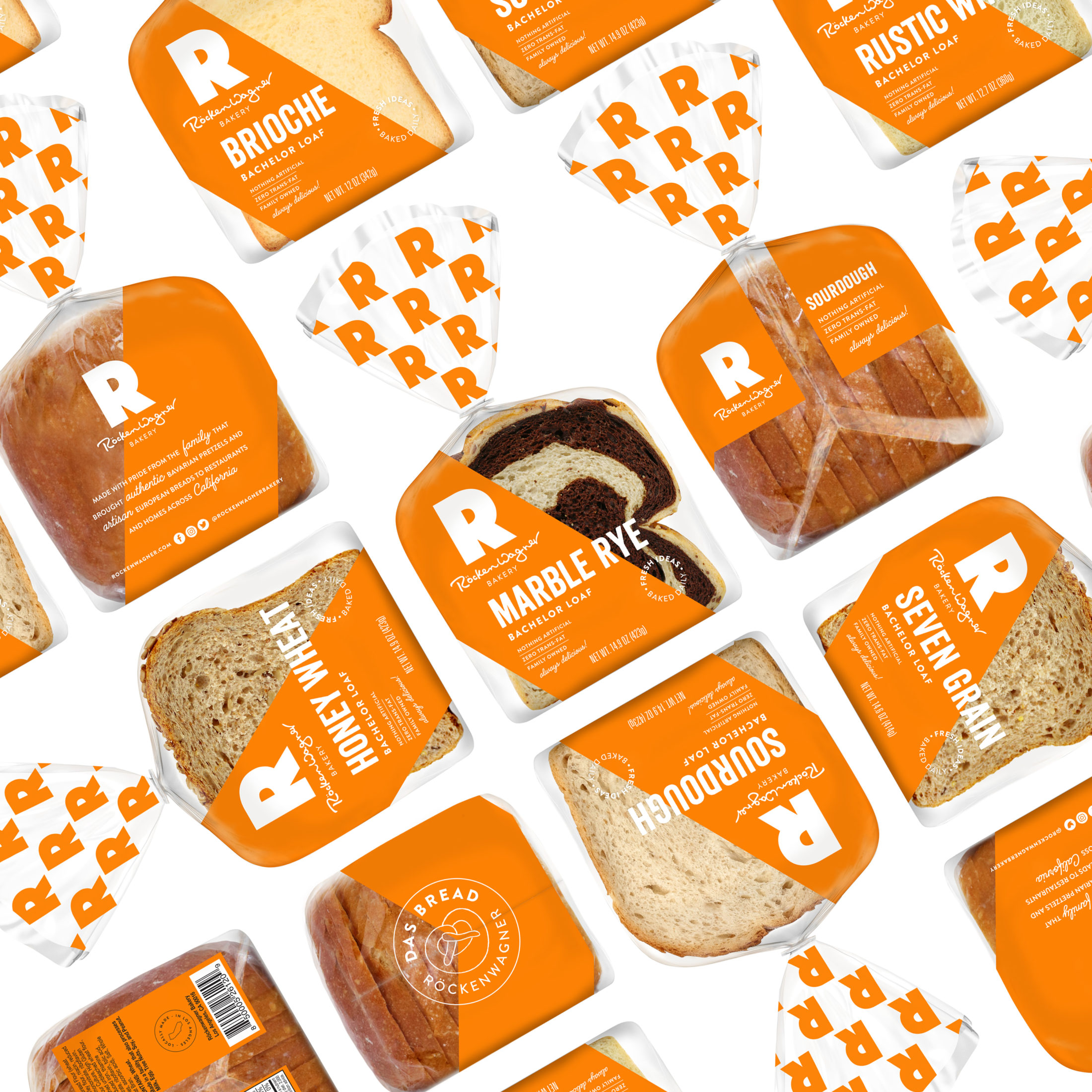
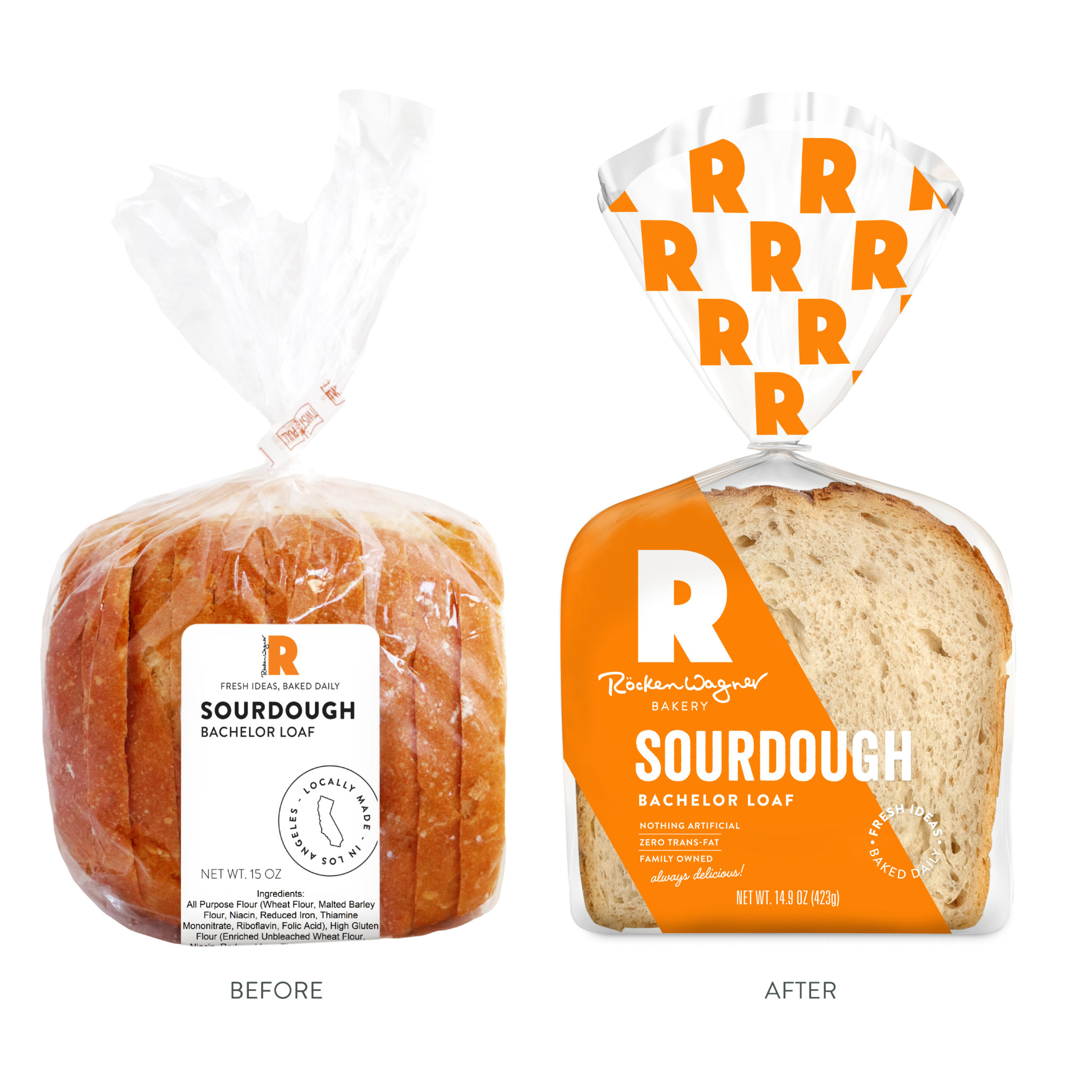
Rockenwagner is a local Los Angeles bakery that offers over hundreds of different thoughtfully handmade artisan breads, pretzels, pastries and more. All made fresh daily in their 24/7 20,000 sq ft facility using only clean, all natural ingredients. One can go visit their cafe in heart of Los Angeles, or check out a Southern California grocery stores like Whole Foods, Gelsons, Bristol Farms, Lazy Acres, or Lassens to try one of their delicious loaves. With the growing of their company, Rockenwagner came to The Creative Pack to redesign their bachelor loaf packaging, which consisted simply of a Rockenwagner sticker put on a standard plastic bread bag. Already familiar with the branding, having redesigned it back in 2017, The Creative Pack was committed to giving the packaging a bold new look that is distinct and ownable to Rockenwagner using their signature orange and “R” logo.
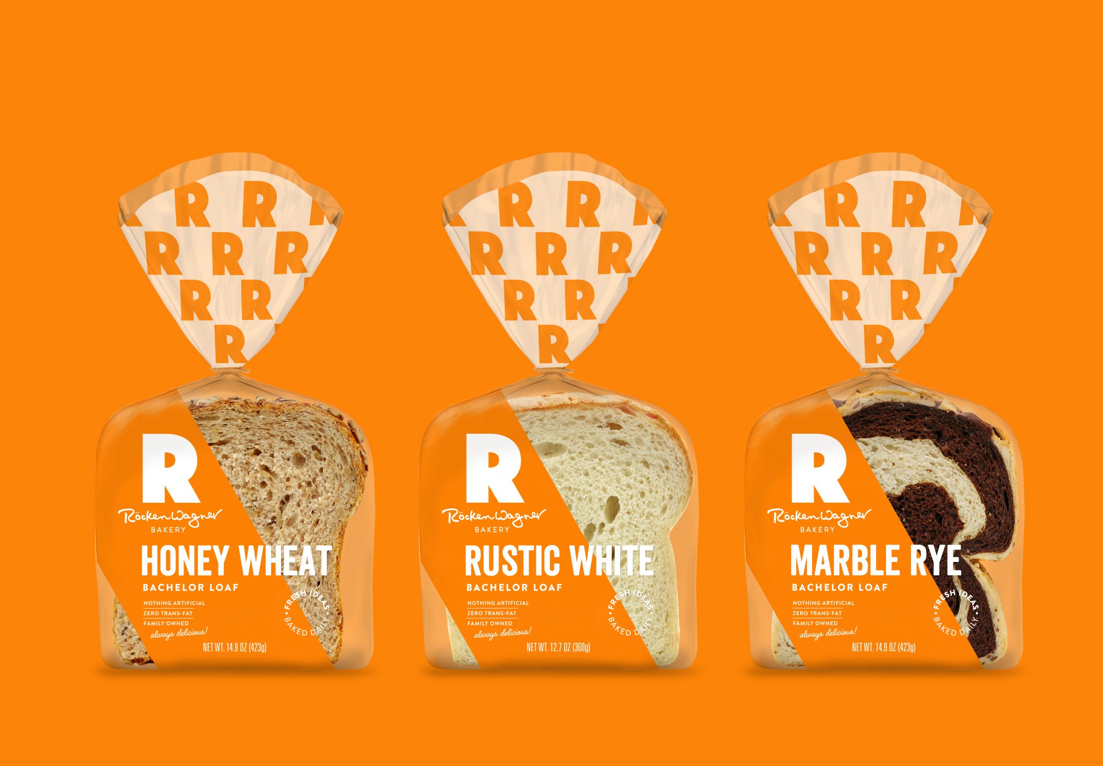
The new bag packaging is eye-catching, playful and really emphasizes the Rockenwagner brand. The packaging is dynamic with the orange slash across the packaging that acts as a holding device for text while simultaneously allowing the bread to shine. The slash is inspired by the diagonal element in their signature letter R, which can be seen through out the design. The new design has great shelf stand out and allows for the Rockenwagner name to be known loud and clear.
The design has been so well received that it has even won a 2021 GDUSA Graphic Design Award. To go see more of our work with Rockenwagner, go to our work page.