Return to Blog
Revolutionizing School Lunches With Revolution Foods
Revolution Foods reached out to The Creative Pack to develop a new visual design system using their existing logo and brand pillars. They wanted the branding to feel consistent and cohesive across various packaging types, consumer age groups, as well as have the flexibility to expand into other channels further down the line.
The Brief
- To create a master brand design system that guides a consistent and cohesive look & feel across various packaging types and consumers (elementary, middle, high school, grab ‘n go for college kids), flexible enough to accommodate future expansions into other channels.
- To inform brand equity and key messages of Revolution Foods.
- To communicate kid-inspired, chef-crafted food, packaging should reflect the quality of our food and trigger desire for consumers (kids or adults) to want to eat it.
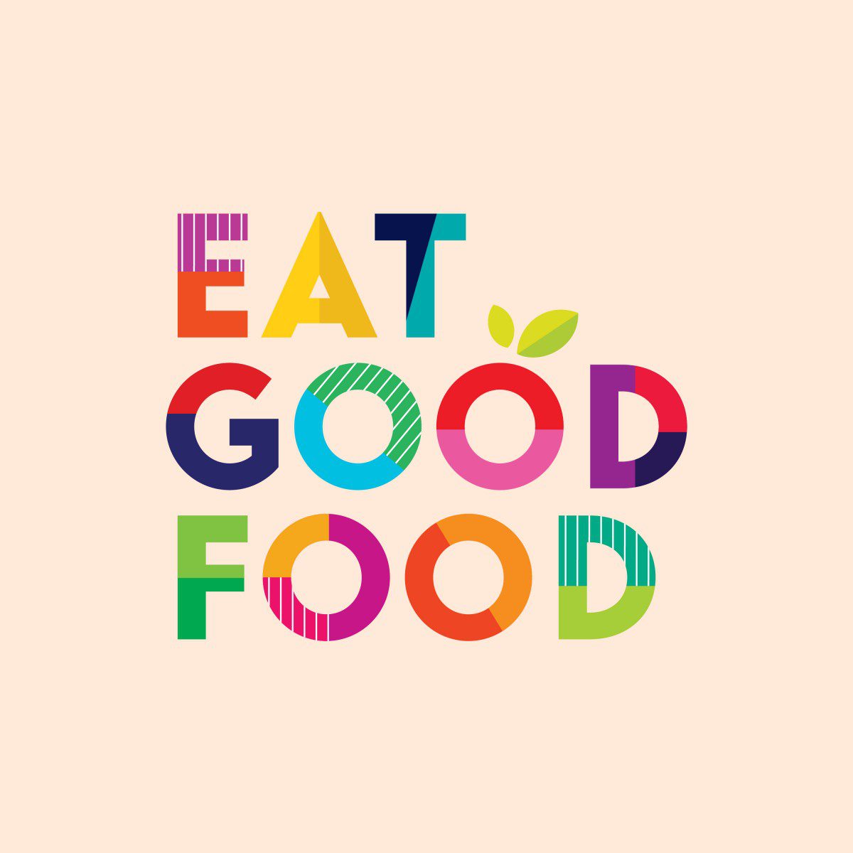
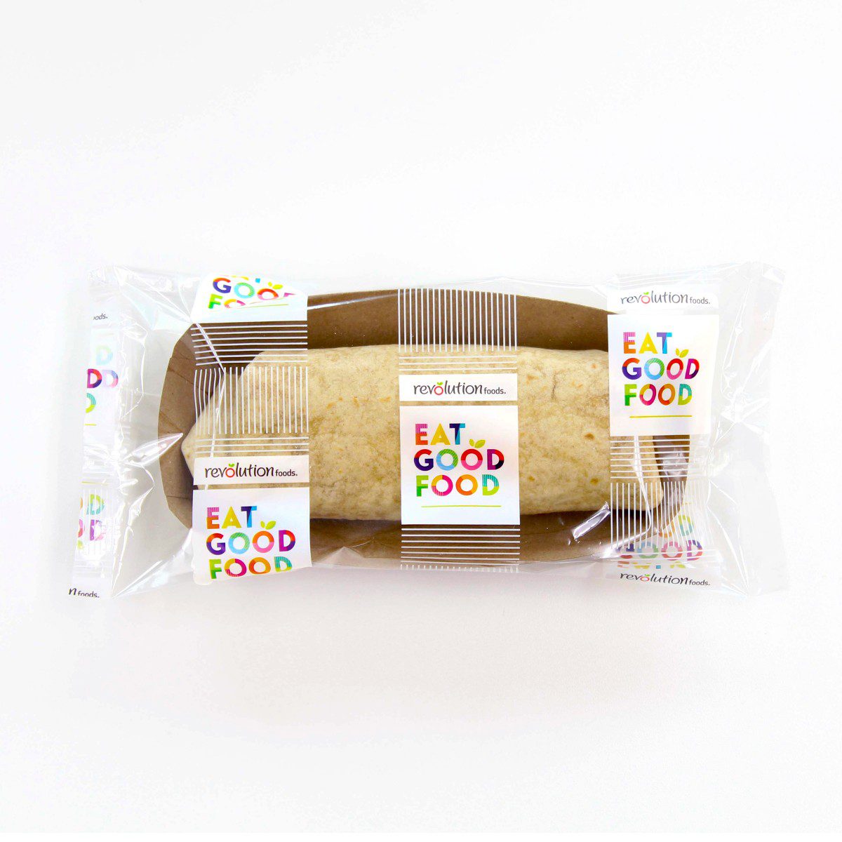
From this feedback, we created a concept that gets right to the point – EAT GOOD FOOD! It is direct, confident, and the hero of this design. The immediate messaging echoes the brand’s revolutionary stance on food – loud, proud, good nutrition for all! This design takes clean, sans-serif typography and transforms it into a visually impactful piece of art through graphic & playful patterning. It uses a sophisticated rainbow color palette that appeals the appetite of all ages.
![]()
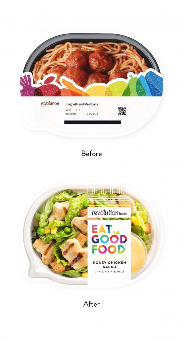
The modern branding is a breath of fresh air – maintaining an ideal balance between colorful & elevated. Naturally, it implies leadership without being authoritative, and therefore has the potential to inspire the next generation of healthy eaters with its motivational messaging. As for the challenge of handling film condensation, this was solved with a new anti-fog film. Now, there’s better visibility to the food, a request high on the list.
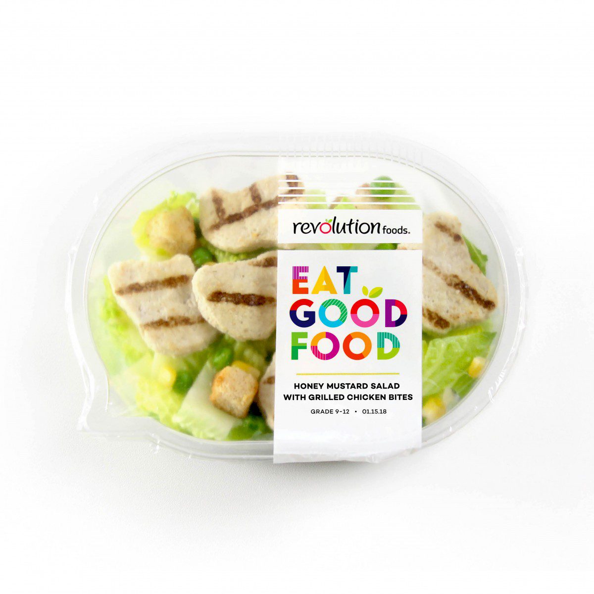
The white background solution is modern and refined for the more mature consumer, yet still contains an element of playfulness in the bright colored typography. Thus, this design is retail ready, easily translating from school cafeterias to direct-to-consumer channels.