Return to Blog
PICCINI NAMING + AWARD WINNING BRANDING
It all began as a store space and concept. It’s your local fast casual spot to bring home to the family after a long day, where cooking seems like the last thing you would want to do. When described as “fast casual” this doesn’t mean drive thru or “ready in 30” quality – its food like your favorite local Italian joint with your typical red checked table cloths, candle lit tables, and food so amazing the only thing left is a single drop of sauce staining the white cloth napkin. Its the spot you crave over and over again. Food meant for the whole family that all will enjoy. Phase 1 – Naming. With an Italian family background rooted in cooking, it needed to be Italian and have a friendly, neighborhood feel. And since, Italian isn’t South Bay local’s first language, easy to pronounce was also key to determining the perfect name. After extensive naming exercises and research – the no name restaurant became Piccini. Piccini, Little Ones in English, is in honor of this family run company’s two sons. It is a business that will be passed on from generation to generation. The name, Piccini, also derives from the intention of making this restaurant one for the whole family.
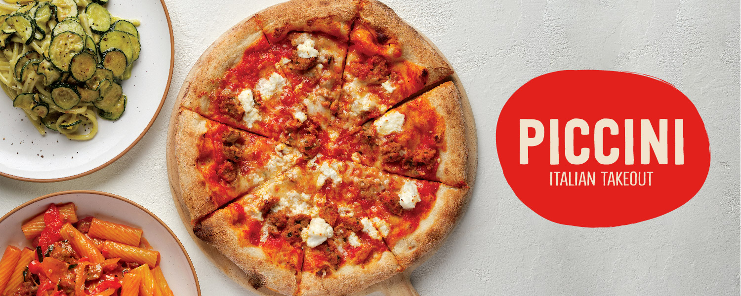
Phase 2 – branding. With the name Piccini, the branding already helped develop the look and feel. It’s a more friendly, youthful, fun personality than your classic Italian white table cloth joint – its Neighborhood Italian. The look is modern, but with elements that are child like. The logo is an uppercase handwritten block typeface. It is meant to be easy to read, but with imperfect lines and shapes. Underneath in a thinner lettering is the descriptor “Italian Take Out,” all which is held in an irregular oval holding device, which allows the word “piccini” to stand out amongst all around it. The logos charming irregular qualities all make one see the hand quality that is reminiscent of how the food is being made – authentic, crafted, and artisan.

Additional branding include creating custom food illustrations of some of the classic Italian dishes, all that can be found on the Piccini menu – a slice of pizza, rigatoni pasta, a salad and their famous Grandma Dot’s meatball sandwich. These illustrated elements can be seen on Piccini’s to go packaging like pizza boxes, and on the website, they even became a custom patterned wall paper inside Piccini’s interior space.
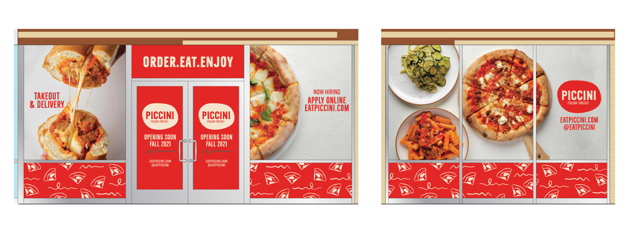
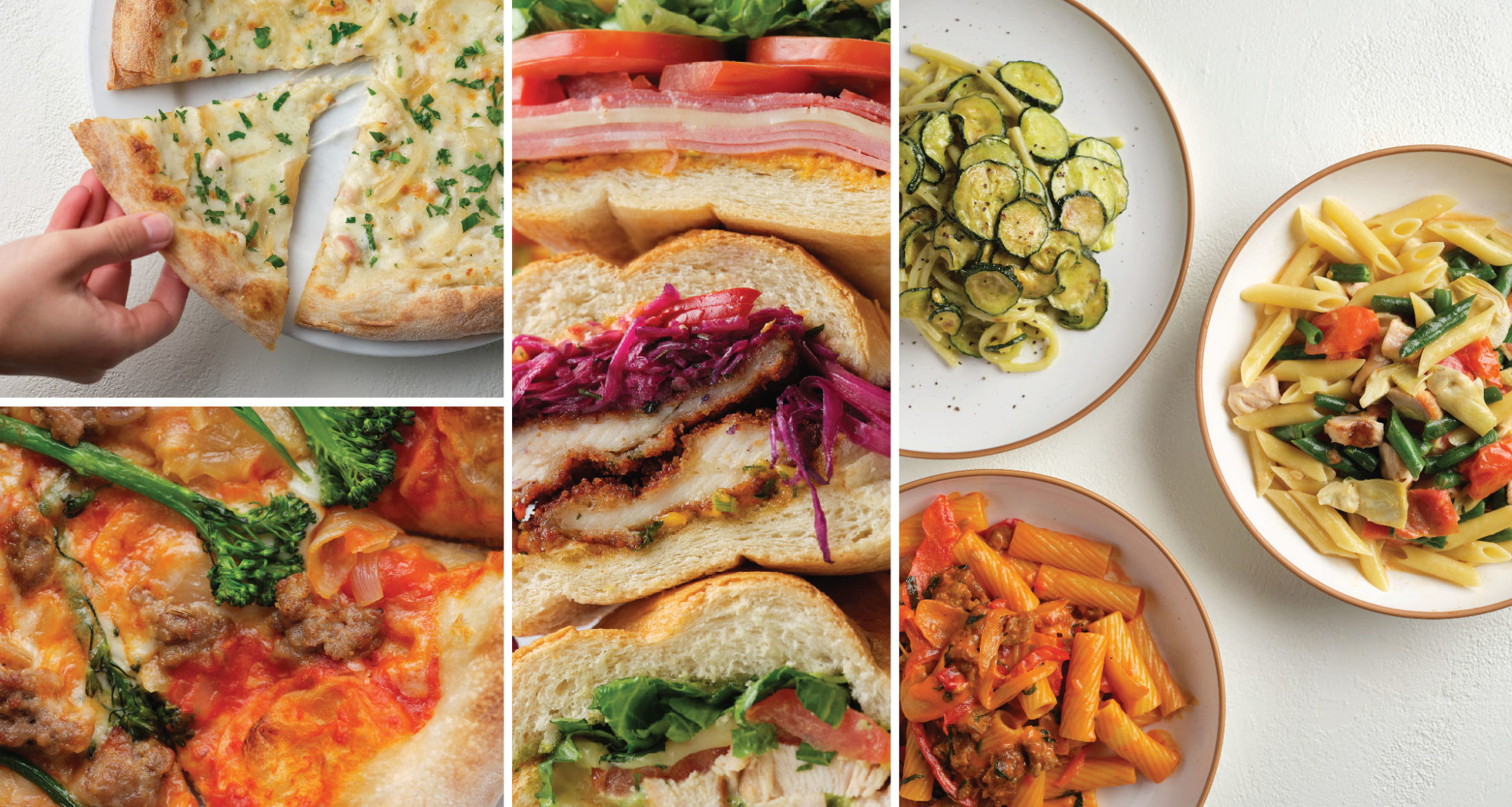
With the Piccini brand being a restaurant it would not complete without some amazing, food photography. We worked with a photographer to shoot some of the iconic dishes. All in a clean modern style with heavy usage of white backgrounds with texture to add extra appeal. The food was shot to look delicious and mouthwatering, but also slightly imperfect and messy to keep a friendly, casual look and feel. Shots range from up close details of thinly sliced prosciutto, to overflowing stacked sandwiches creating a sandwich tower, to melty gooey cheese on top of slices of pizza giving that Instagram perfect “cheese pull” moment. The photography was utilized for opening store vinyls, website, marketing and online ordering.
The branding as well as the opening store vinyls both won GDUSA Graphic Design Awards.
Piccini is now open! Go order take out at –
464642 Del Amo Blvd, Torrance, CA 90503