Return to Blog
fresh & simple™ 2.0 – The Power of Thoughtful Evolution
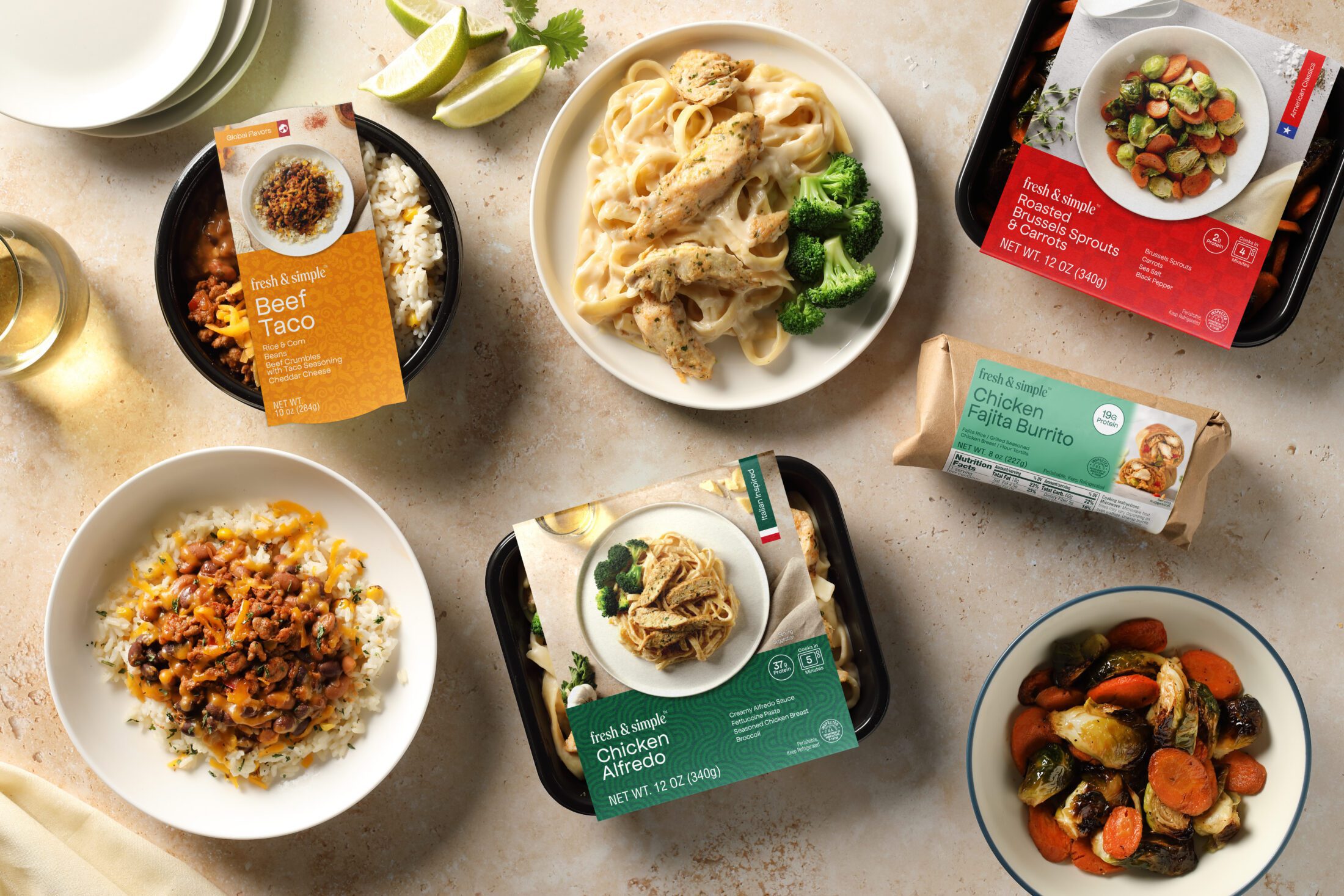
Launching a new package isn’t always the finish line. Once a product reaches the shelf and consumers begin interacting with it, brands gain invaluable real-world insights. Sometimes the answer isn’t a complete redesign, it’s what we call a “2.0,” or a refresh. Its a thoughtful evolution that builds on whats already working.
Most often, it’s about refining an already successful design and optimizing it. This is especially common when brands transition from direct-to-consumer into retail or club channels, where packaging must compete within a much more complex shopping environment.
These refinements can take many forms: increasing the size of product names for faster recognition, introducing stronger color coding to differentiate flavors or varieties, adding or enlarging product photography to improve appetite appeal, or reworking the information hierarchy so shoppers can find what they’re looking for in seconds. Individually these changes may seem subtle, but together they can dramatically improve the shopping experience while strengthening the brand.
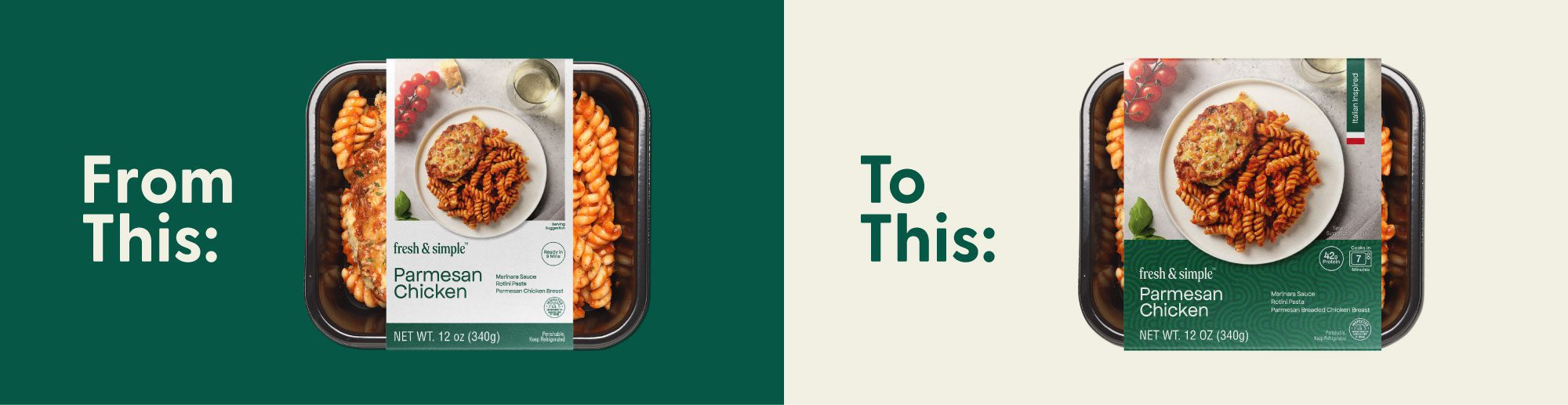
A great example of this evolution is our work with fresh & simple™, a line of chef-prepared meals ready in minutes. The original packaging beautifully embodied the brand promise, clean, modern, and uncomplicated. Predominantly white with accents of fresh & simple™’s signature dark green, it created a distinctive brand block within the refrigerated aisle and established an ownable shelf presence.
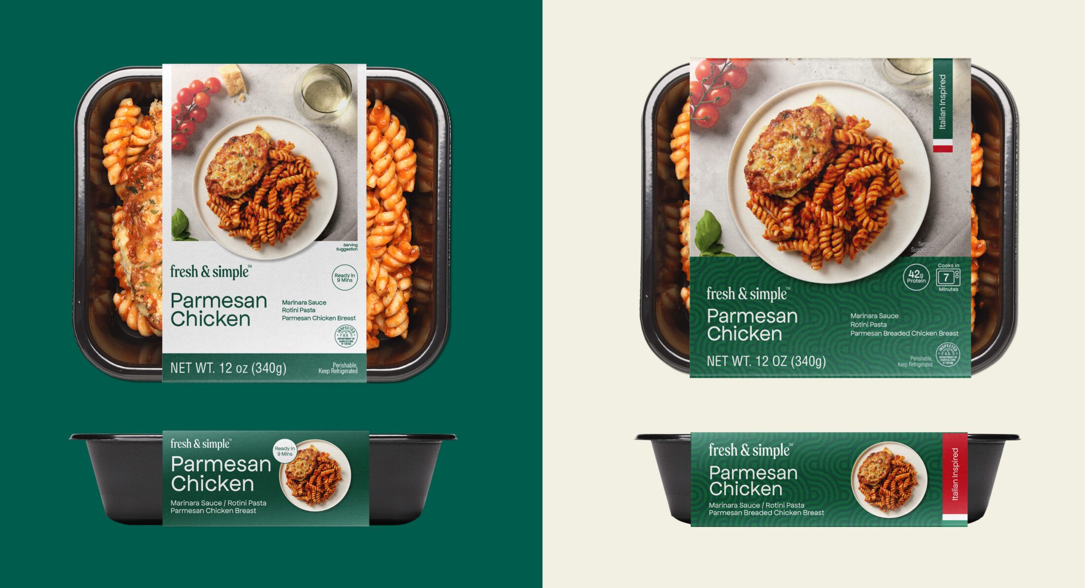
From there, we refined it. A strategic color system was introduced to create clearer differentiation across meal categories and individual SKUs, making navigation faster and more intuitive. Subtle background patterns reinforced each cuisine type, like Comfort Classics, Italian Inspired, and Global Inspired. This added another visual cue while bringing more personality to the range. Product photography was enlarged to occupy nearly 60% of the front panel, increasing appetite appeal and allowing the food to become the hero of the package. Even the sleeve dimensions were enlarged, expanding its width to cover more of the tray. This created additional space for product information, improving legibility without sacrificing the clean, modern aesthetic.
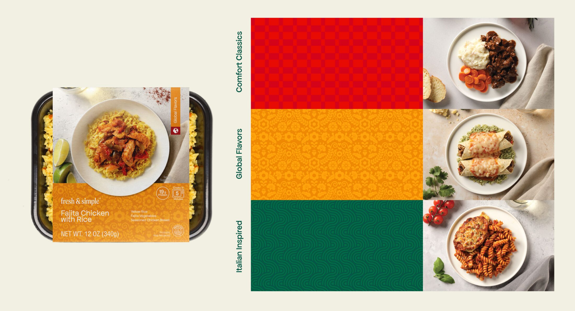
The result was a packaging system that preserved the brand consumers already knew and trusted while strengthening navigation, improving communication, and building greater consistency across categories. Through thoughtful use of color, pattern, photography and information hierarchy, fresh & simple™ gained a flexible design system capable of growing alongside an expanding product portfolio.
The goal of a packaging refresh is to help a brand/package become a better version of itself. As brands evolve, their packaging should evolve with them, continuously optimizing the design while reinforcing what made the brand successful.