Return to Blog
La Terra Fina Rebrand
“Clinking glasses and overflowing plates. Warm conversations sprinkled with laughter. Delicious food, simply enjoyed. These are the moments we’re made for.”
La Terra Fina has been using quality ingredients to make food you’ll want to share, from delicious dips to quiches. The consumers love their products, yet often they don’t notice the brand who makes them. The Creative Pack and Seattle-based agency, Hornall Anderson, worked closely with La Terra Fina to create a new look for a long-term position in the marketplace.
As the creative lead, Hornall Anderson was tasked with transitioning the dated branding and packaging system into an identity that was focused on the consumer’s experience and enjoyment. It was The Creative Pack’s challenge to apply the new look onto La Terra Fina’s entire line, including current and upcoming products, and to maintain the integrity of the brand for all packaging and branding needs.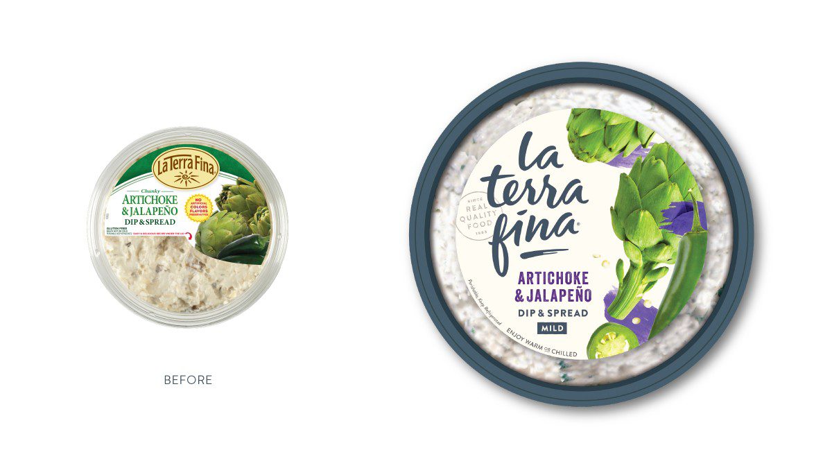
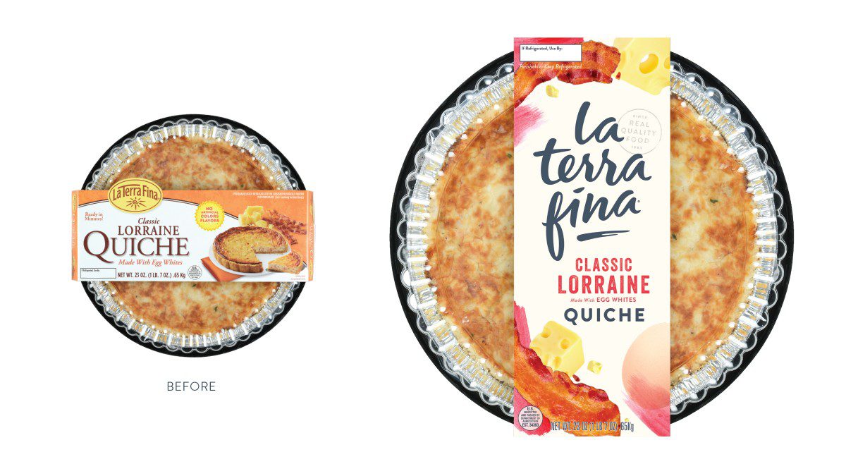 Our objectives:
n
It began with the phrase “A Generous Helping.” This phrase represents a brand that is “host forward,” inviting and considered, that is made for the consumers, who want to spend more time in the moment and less in the kitchen.
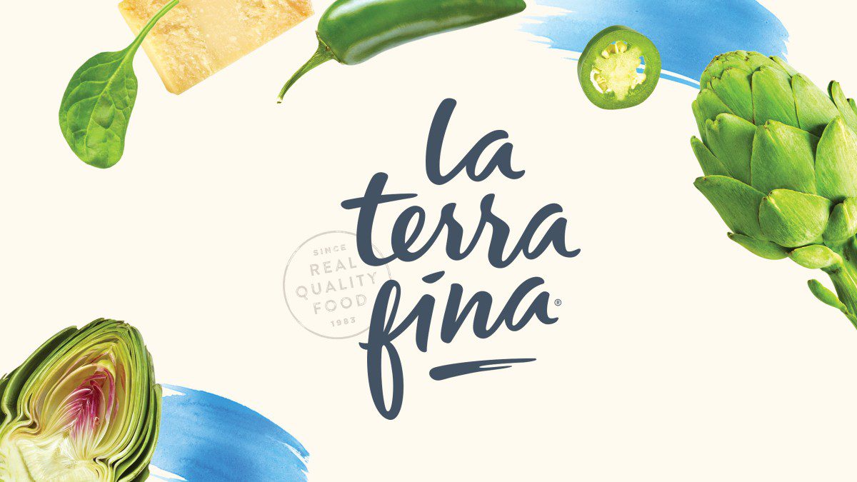
The La Terra Fina wordmark is a signature to the dedication to real quality ingredients, it represents the human care that goes into everything they do and make. The handmade letterforms move in a joyous, musical rhythm and represent the inviting personality of the brand. A rubber-stamp like seal reinforces the commitment to quality and the timeless values, giving a small batch, handcrafted-feel.
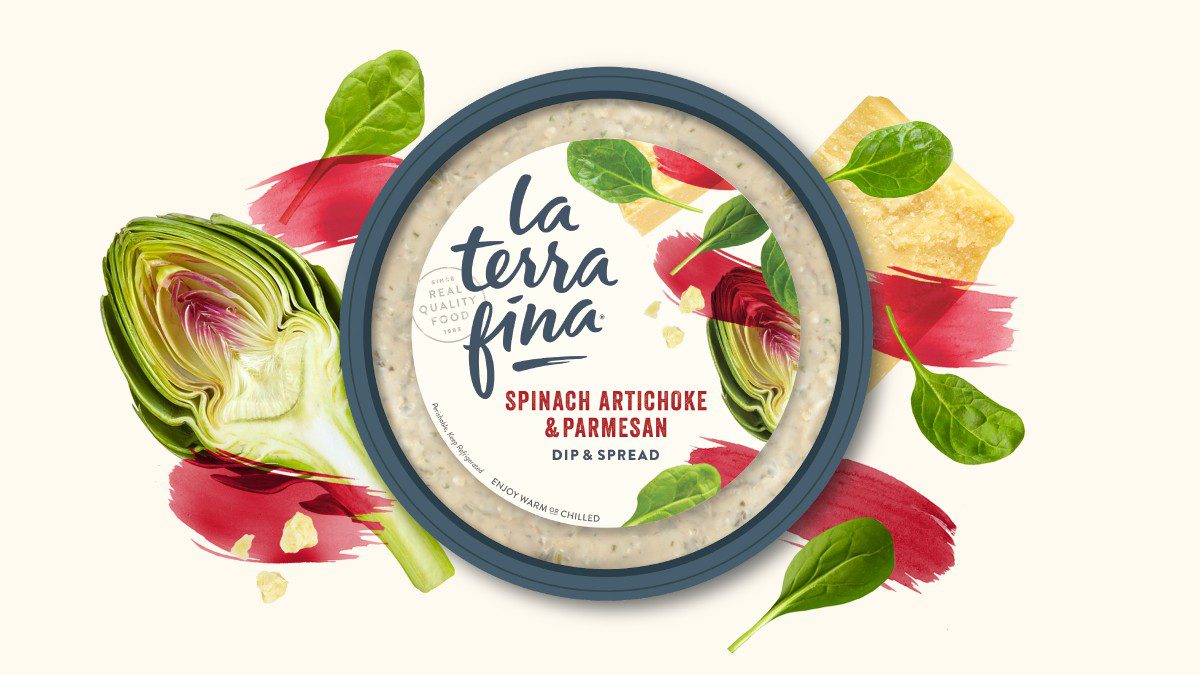
The design is a composition of watercolor swashes and ingredient photography that are artfully considered around the La Terra Fina signature. Like a poetic dance of ingredients, the photography creates a sense of rhythm and abundance, while highlighting the freshness of the product. The ingredients feel as though they’ve been picked up from the market and are being chopped, tossed and thrown together in preparation.
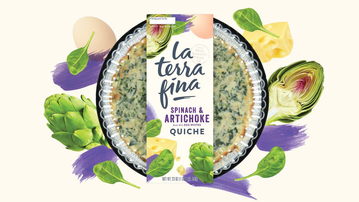
The packaging architecture was strategically designed to ensure La Terra Fina gets the credit and recognition it deserves for the real, delicious food. Inviting, fresh and wholehearted, the design creates the emotion a brand needs to connect with consumers and the longevity to stay relevant to the market.
The new look for La Terra Fina has received a positive response from consumers and retailers since the re-launch. La Terra Fina products can be found at grocery stores, specialty retailers and club stores all across the USA, Canada and Mexico.
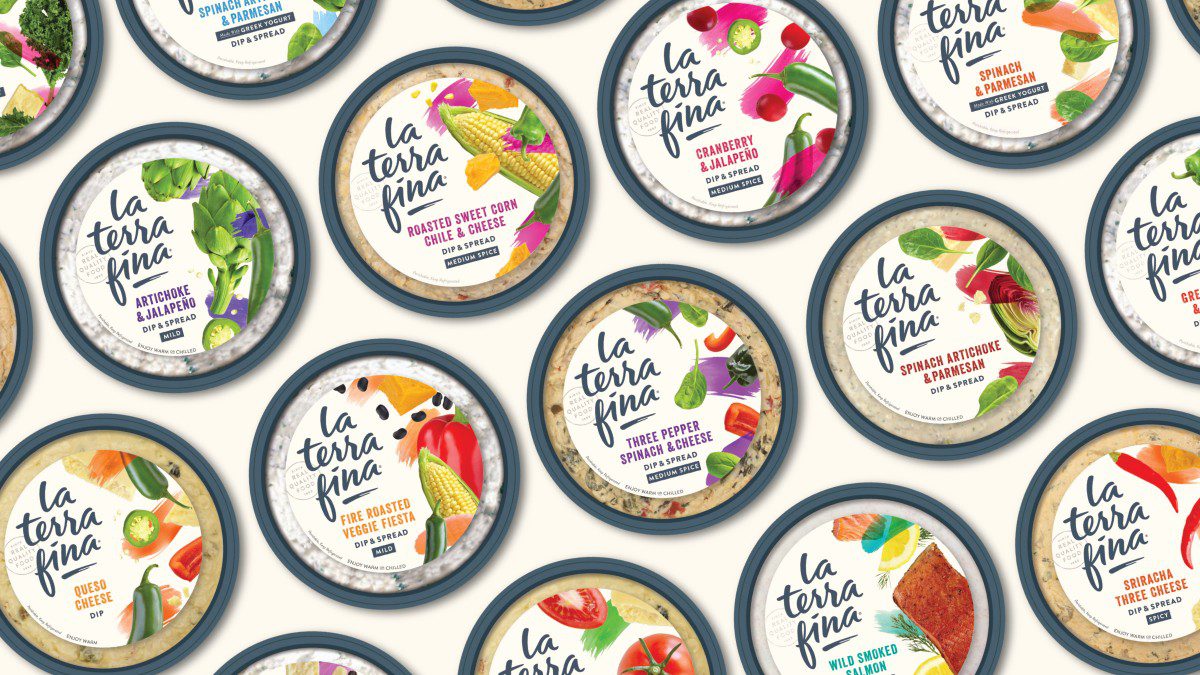
So proud that the La Terra Fina rebrand has already won a 2018 GDUSA Package Design Awards for Dips & Spreads and 2018 GDUSA Package Design Awards for Quiches.
Download the press release here.
Check out this project on the dieline.
