Return to Blog
Fresh Thyme Market Reserve, New Premium Tier Wins Vertex Award!
Fresh Thyme approached The Creative Pack to design their new premium range within their private label. The premium range needed to feature a new look for the brand, completely separate from their natural range, yet still maintain the essence of Fresh Thyme. The design needed to be sophisticated, look expensive and reflect the high quality product inside. The Creative Pack wanted to create a design worthy of being left out on someone’s shelf to showcase.
 The Brief
Design new branding that looks premium
Translate the Fresh Thyme branding into a premium design
Develop a system similar to Fresh Thyme natural branding to identify skus
Create a brand name for premium tier
Fresh Thyme approached The Creative Pack to design their new premium range within their private label. The premium range needed to feature a new look for the brand, completely separate from their natural range, yet still maintain the essence of Fresh Thyme. The design needed to be sophisticated, look expensive and reflect the high quality product inside. The Creative Pack wanted to create a design worthy of being left out on someone’s shelf to showcase.
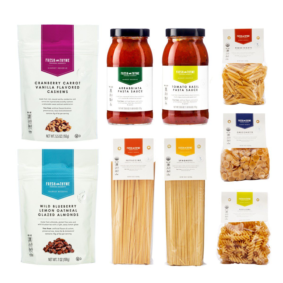
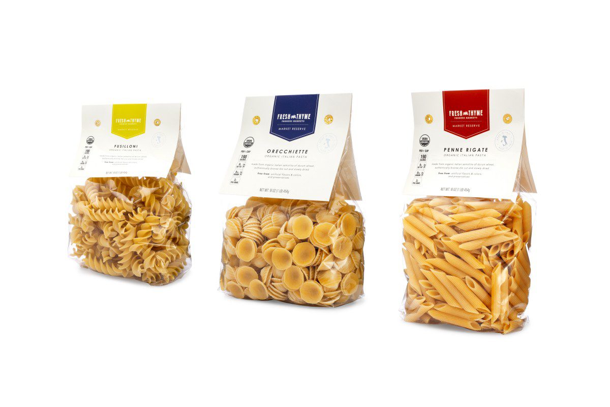
Under the subbrand, Market Reserve, Fresh Thyme’s Premium Range is defined by its minimalistic, clean design. It’s characterized by its cream color background, one size one weight title treatment, color coded tag and metallic silver details.
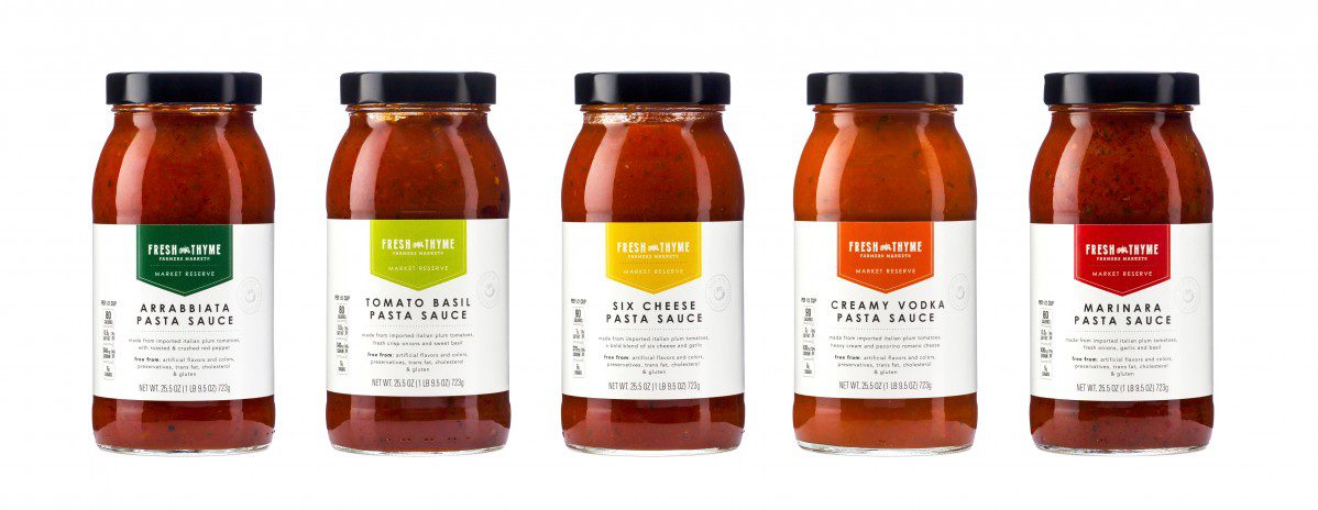
The Fresh Thyme logo is paired back, removing the holding device – just leaving the words Fresh Thyme Farmers Market and the iconic tractor. The logo is no longer curved, but on a straight line mimicking the logo variation on Fresh Thyme’s Body Care Range. Added below is a metallic dotted line (a design feature seen throughout the packaging) and the title Market Reserve, to give the premium range it own identity. The logo is placed within a color coded tag that changes per sku. The color palette is contemporary and slightly earthy to compliment Fresh Thyme’s farm fresh feel. The colored tag easily identifies different flavors within a range.
Metallic details are added to enhance the packaging. The silver is a subtle color shift from the cream background but really shines in the light giving extra texture and pop to the packaging. A silver stamp to the right of the product title highlights a key product feature that makes this product premium. Metallic dotted lines break up information on pack for easy organization of information.
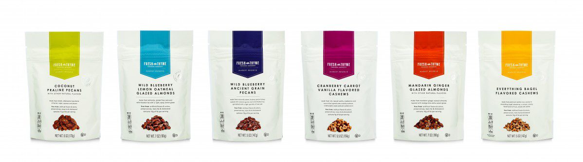
Romantic descriptors of the product, placed underneath the title, highlight the high quality ingredients in the product. Followed by the products free from callouts. Fresh Thyme prides itself on its all-natural, clean products. To reinforce the minimal look, the descriptor is placed in all lower case, which juxtaposes the all capital title. The titles are always in an uppercase san serif font with a one weight, one size title treatment. Though bolder and larger than the rest of the type on the packaging, the title is still relatively understated. The nutrition keys are paired back and only given a thin black stroke to define the information inside.
The Fresh Thyme Market Reserve premium design is sophisticated and elegant in its minimalism. Its bright clean look stands out on shelf and has its own distinct personality in the Fresh Thyme private label ranges.