Return to Blog
Fresh Thyme Essential Oils Range Win GDUSA Health and Wellness Design Award
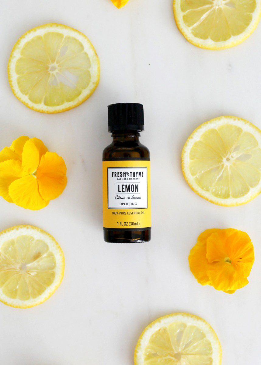
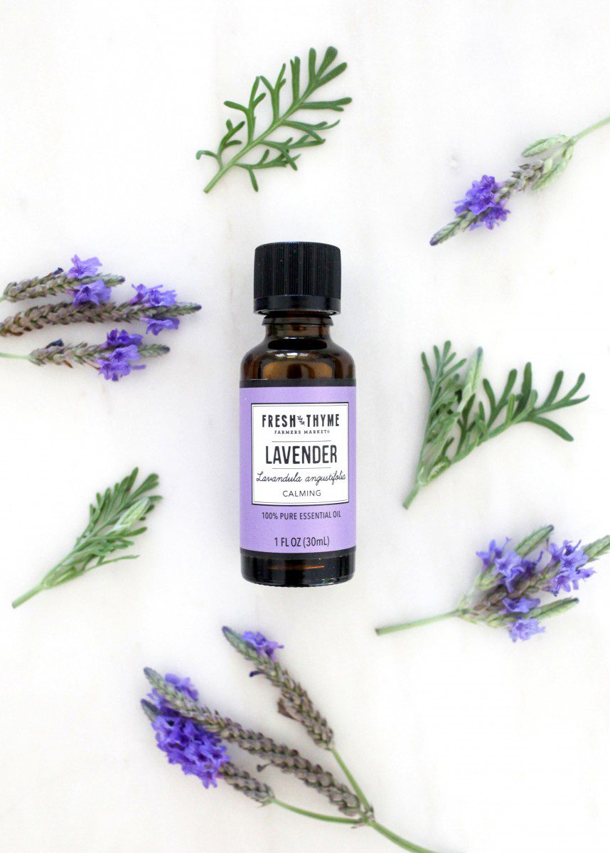
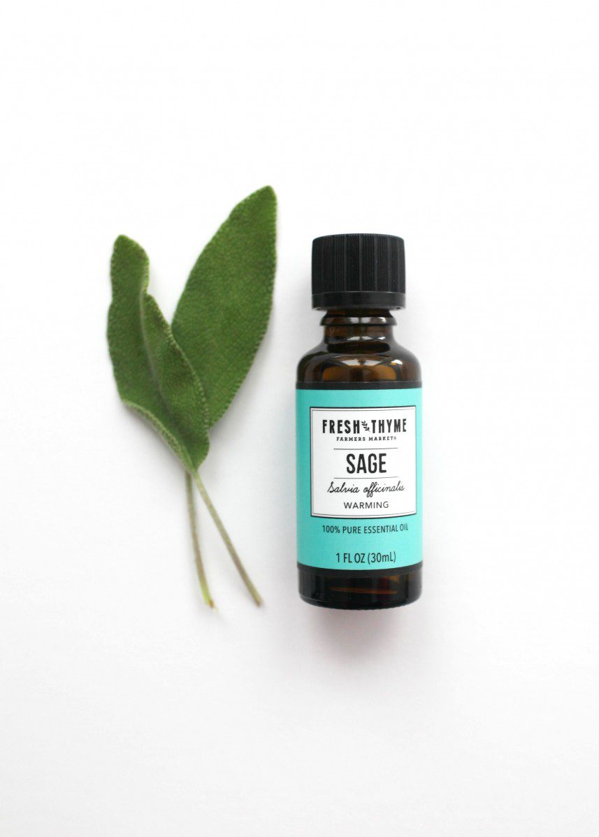
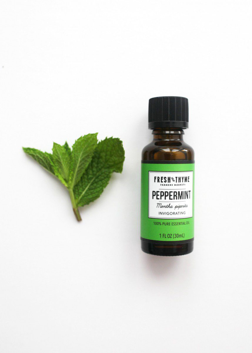
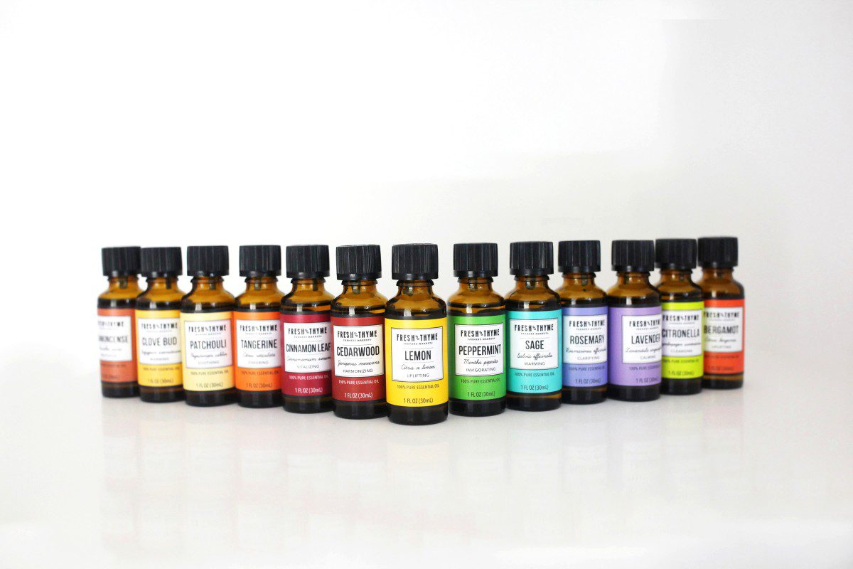
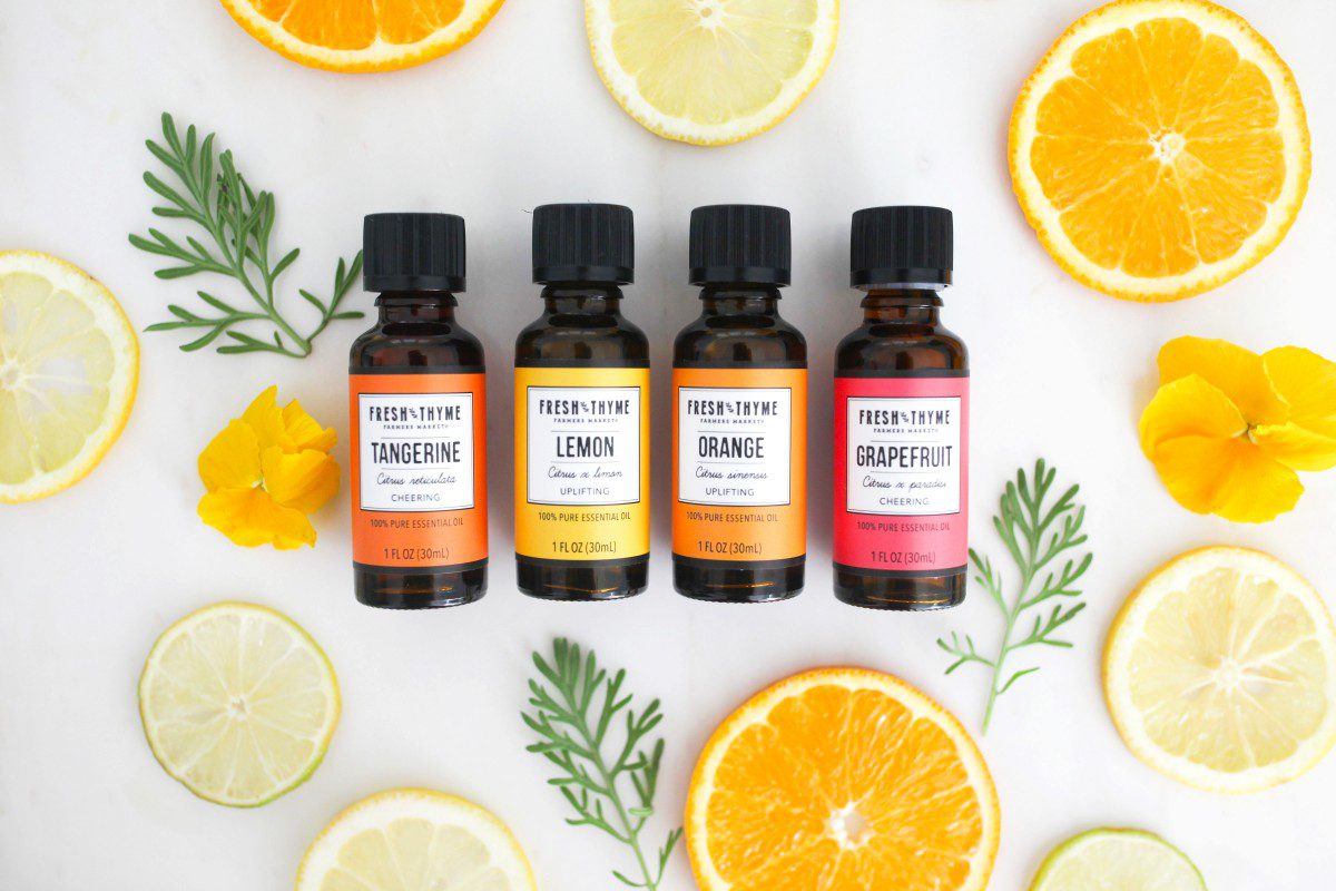
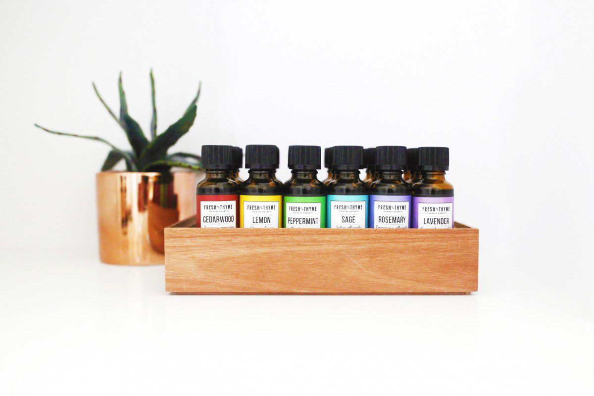
We are so proud to announce that we have won a GDUSA for our design of the Fresh Thyme Farmer’s Market Essential Oils range. As part of the 1000+ SKU private label program, Fresh Thyme asked us to create a design for a new range of essential oils – a twenty product line. As part of the body care range, the essential oils had to follow a similar design but with a slightly simplified look to fit its compact bottles. What really makes this line different from any other Fresh Thyme range is the vast color range – each of the twenty oils has its own unique color making these oils look really good on shelf.
Our objectives –
- n
- To design packaging of essential oils that is cohesive within the existing Fresh Thyme design (Follows the design of Fresh Thyme Body Care)
- To determine a new color coding system to differentiate products
- To develop a range that fits within both the design Fresh Thyme and the essential oil brands.
n
The process began prior to the development of the essential oils range when we were awarded Fresh Thyme Body Care. It was then that a new design was determined. The main objective being – how to translate the existing Fresh Thyme design into a body care range. “What design components should remain the same and what should be changed or added to enhance this line?” In 2016, a range was successfully created that merchandises well on shelf and lends itself to the health & beauty category, all while keeping the essence of the Fresh Thyme brand in tact. This same design, slightly simplified, is applied to the essential oils range.
The sub-brand created breaks away from the current Fresh Thyme branding in a few different ways. One major design shift is the development of the Fresh Thyme logo. The logo was altered to fit a more sophisticated design. It was simplified to one color – black. The border was dropped, leaving just the Fresh Thyme Farmers Market text. The iconic tractor was also replaced with a leaf illustration to communicate the use of plant-based ingredients as well as its beauty and/or body care purpose.
New elegant typefaces are introduced to help differentiate the many scents and flavors. While in the body care range the type of product was highlighted (in the standard Fresh Thyme font), for the essential oils range, the scent is the main focus. In the newly added cursive font is the oils’ ingredients (very similar to the scent name), and in a clean san serif is the scents’ main quality is called out – calming, energizing, refreshing, etc. Everything (excluding the ‘100{711affa2c6bb84f98c0ea8259eb1dff497f250c63645d937340474115af0a357} Pure Essential Oil’), including the logo, sits in a white text box with black trim that is centered on pack.
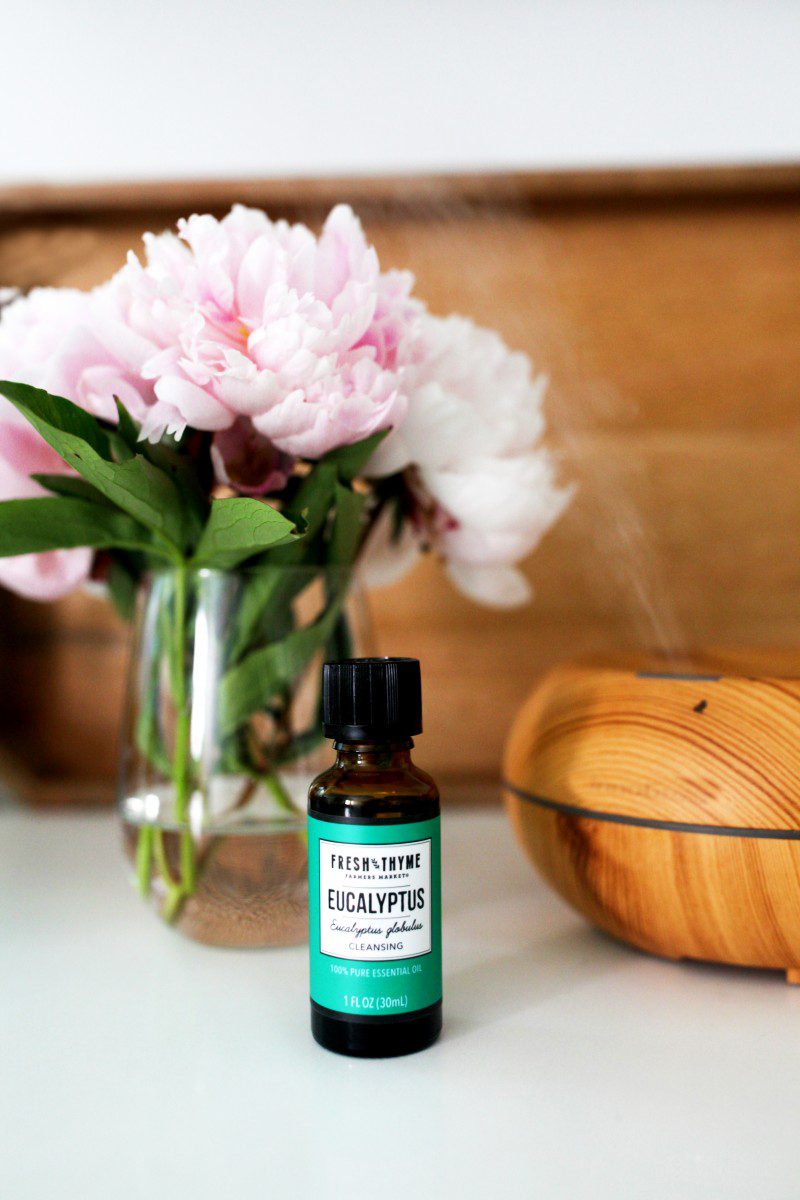
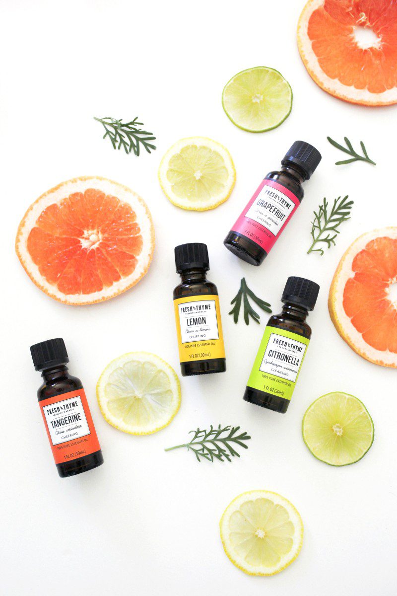
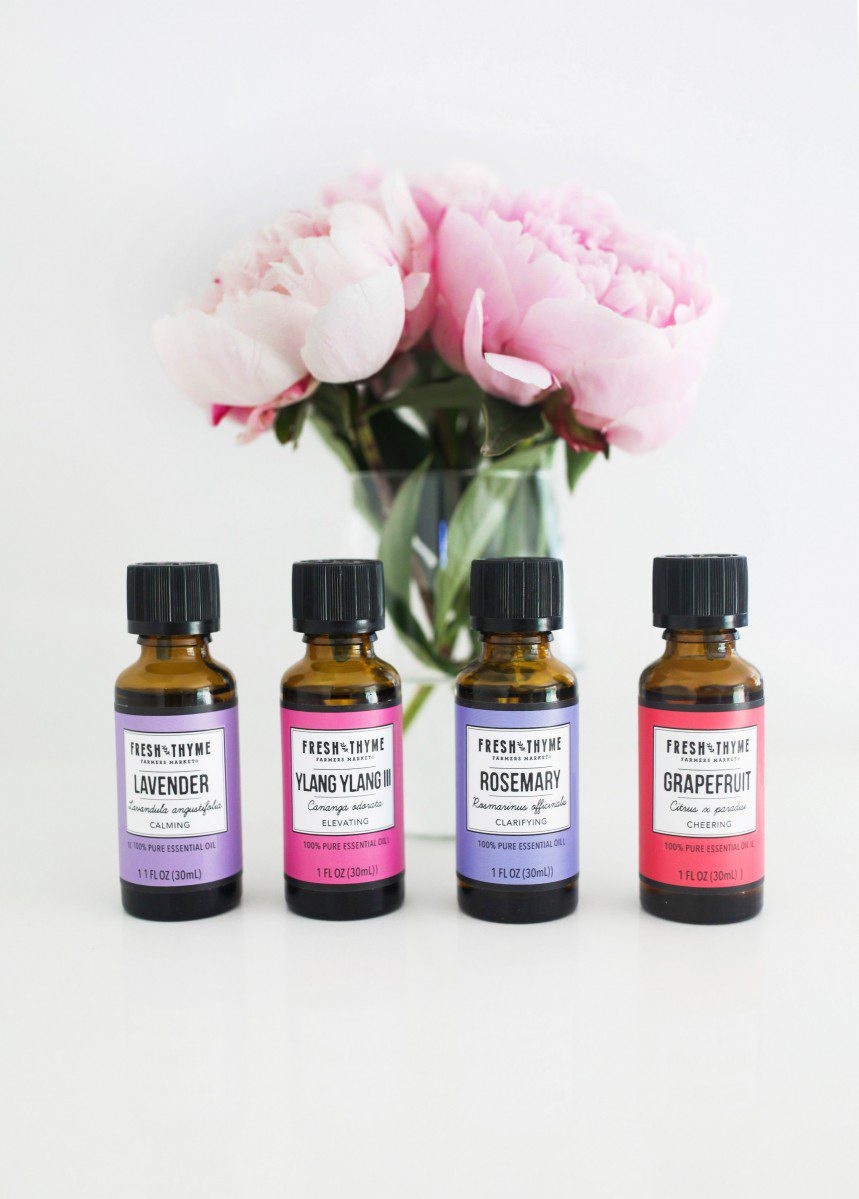
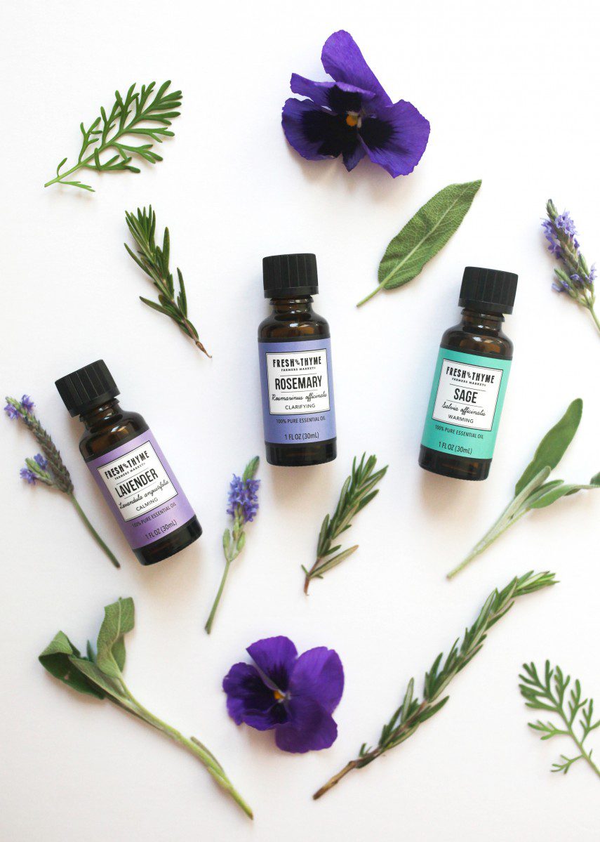
The white and black rectangular box is a great offset to the bright solid color background. Each of the 20 skus has a unique color that corresponds with the ingredient, scent, or quality of the essential oil. This is the largest amount of colors used in one range for Fresh Thyme. This is also the highlight of the range. The rainbow color palate makes this line eye catching on shelf.
This Fresh Thyme’s sub-brand is like the sophisticated older sister of the non-food category. The design is reminiscent of the Fresh Thyme’s core private label design, with a similar structure and strength, but a personality all it’s own. The design is bold, feminine, gentle, honest, and refreshing. The award-winning design creates the emotion a brand needs to connect with consumers and the longevity to stay relevant in a world full of shifting trends.
So proud that the essentials oils design has already won a GDUSA Health and Wellness Design Award.
Download the press release here.