Return to Blog
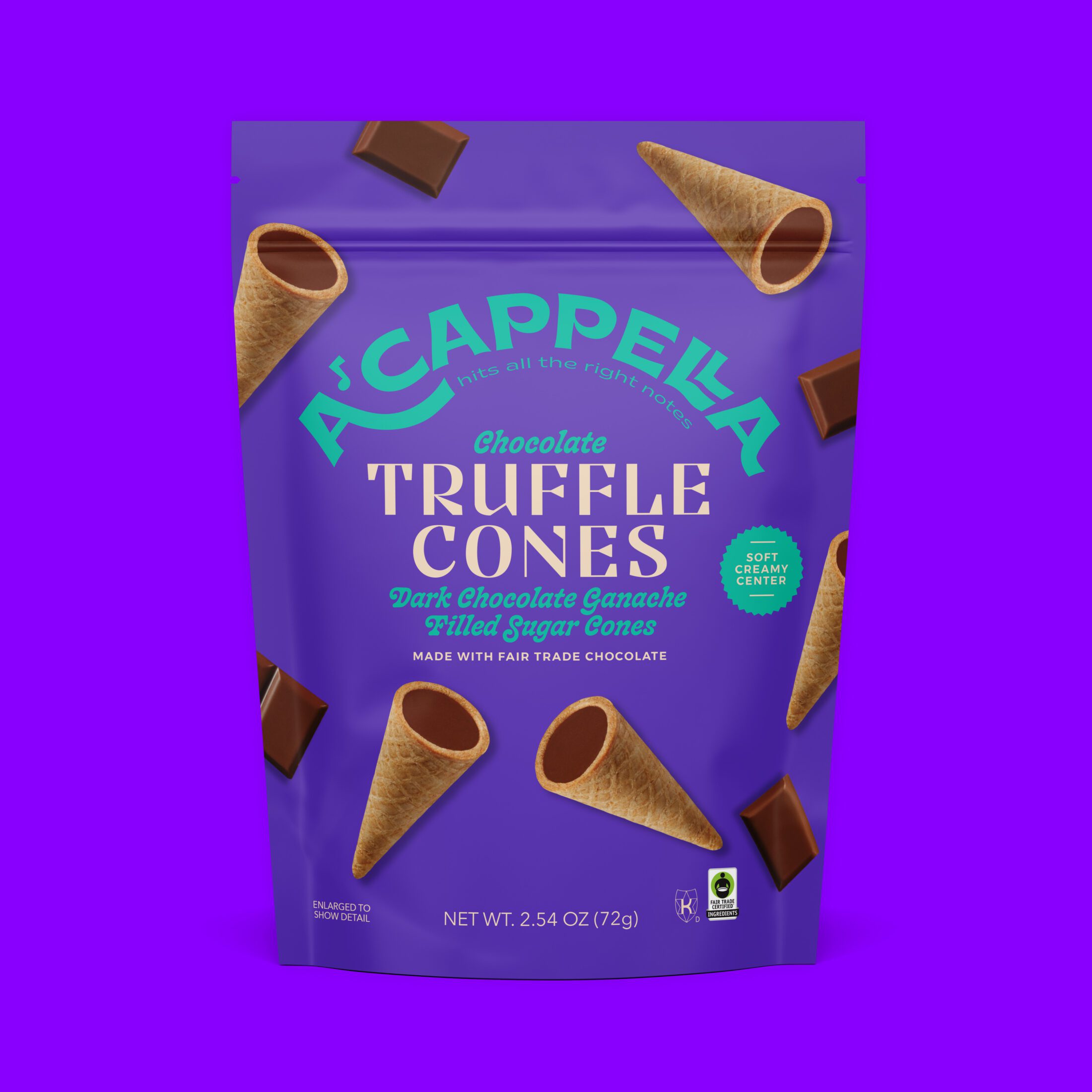
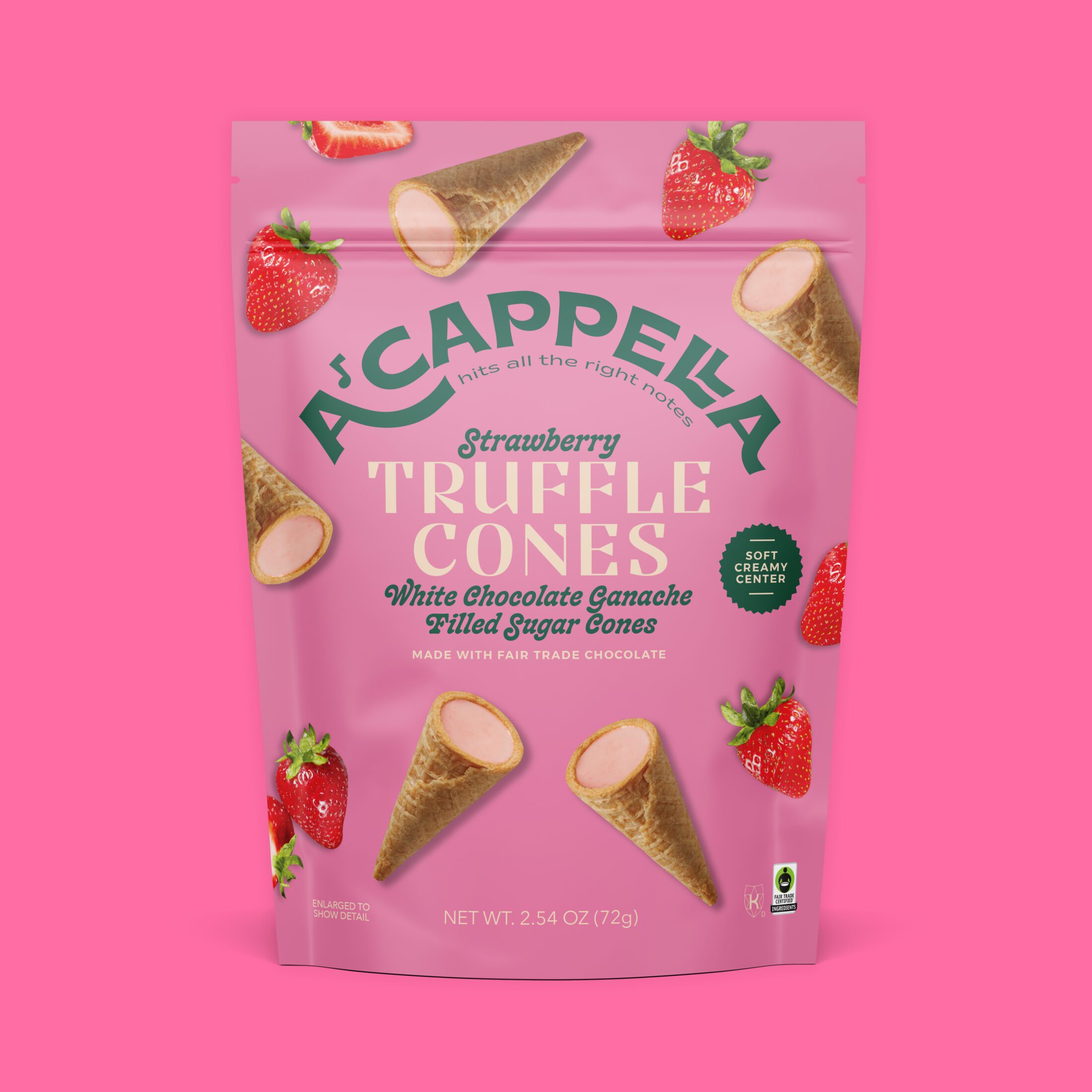
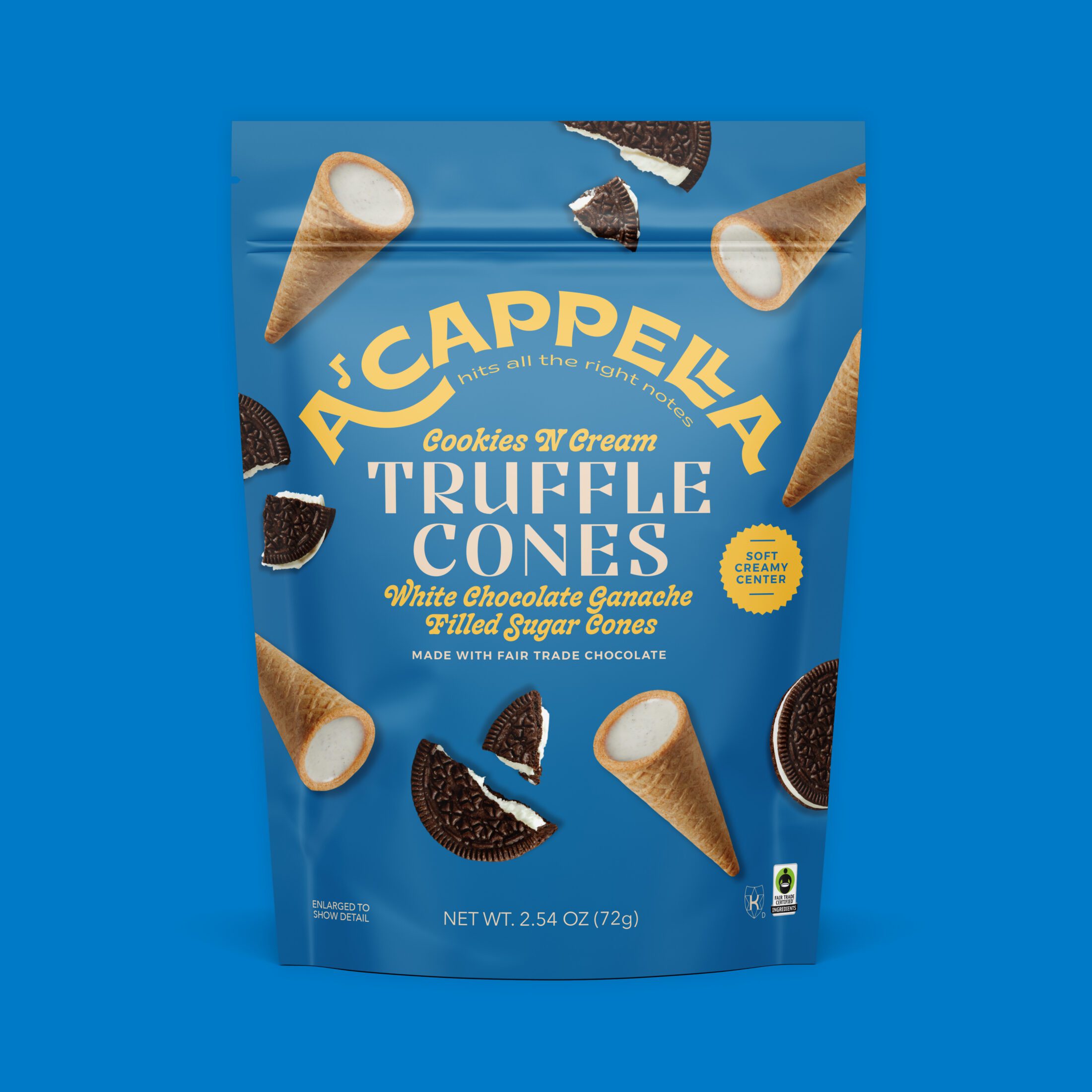
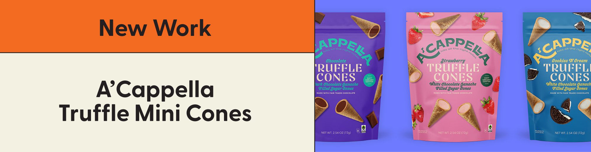
A’Cappella Chocolate Truffle Mini Cones
Remember the last chocolate-filled bit of your favorite ice cream cone? A’Cappella kept the same crunchy cone, but upgraded it to a melt-in-your mouth creamy truffle center. The design needed to maintain the A’Cappella branding with its playful, bold and colorful design, yet also create a unique look for this new product.
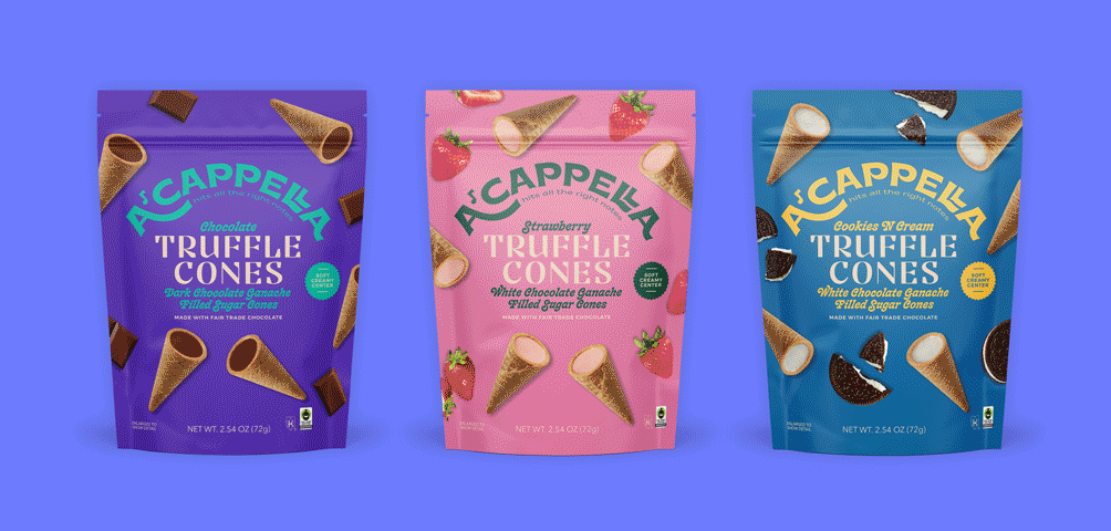
With A’Cappella already having a retro feel, the focus for the Truffle Mini Cones was capturing the nostalgia of going to get an ice cream cone on a hot summer day. Whether that be from your local ice cream parlor or truck. This can be seen in the curved, groovy italic typeface of the flavor name and product descriptor – bringing A’Cappella into the ice cream esque world. The colors play off the flavors themselves as well as add a nice backdrop for the dancing photography to shine. It’s a fun, inviting, light hearted design that truly captures what enjoying a Truffle Mini Cone should be. Enjoy all your favorite flavors of summer days without the brain freeze! Read about how we created the A’Cappella branding and packaging design here.