
Return to Blog
The Art of the Brand Extension
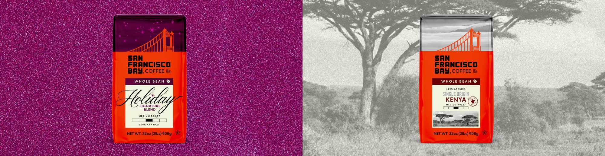
After redesigning San Francisco Bay Coffee’s core range, we were tasked with expanding the new visual system into two distinct offerings, a premium Single Origin range and a limited-edition Holiday Blend. Each needed an identity appropriate to the product while still feeling unmistakably part of the larger San Francisco Bay Coffee family.
This is where designing within an established brand system gets interesting. Rather than starting from scratch, the challenge becomes understanding which elements are essential to recognition and where there is room to play. That often means returning to the brand book and understanding the established “dos and don’ts,” which elements are essential to maintaining brand recognition and which have the flexibility to evolve. New products and limited editions offer an opportunity to stretch the brand, introduce new visual cues, and create something unexpected without losing the established brand.
For both ranges, we began by identifying our brand constants, the elements that make San Francisco Bay Coffee feel like San Francisco Bay Coffee. The signature red, Golden Gate Bridge, flooded red logo panel, cream information block, and San Francisco skyline all became anchors for the extensions. Interestingly, the skyline wasn’t initially considered a brand constant, but through rounds of exploration and iteration, its importance became clear, ultimately reinforcing its role as a recognizable part of the brand. With those elements established, we could explore how color, finishes, typography, photography, and hierarchy could give each range its own personality.
Elevating the Everyday: Single Origin
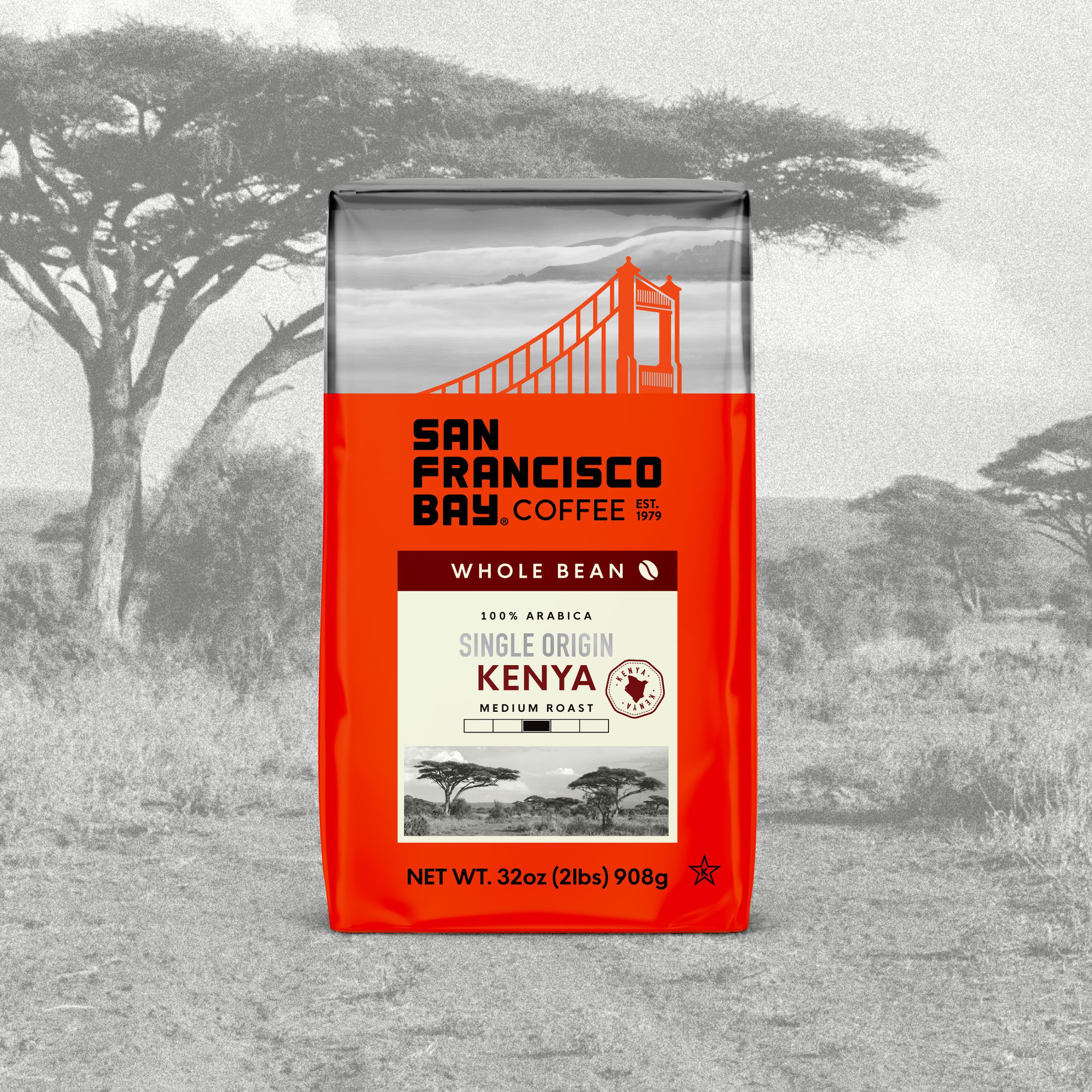
The Single Origin range sits at a higher price point, featuring specialty coffees whose flavors are shaped by one specific region’s climate, soil, and altitude. The packaging needed to communicate that distinction and appeal to coffee drinkers who appreciate not only where their coffee comes from, but how that specific place influences its unique flavor and character.
The most immediate shift is the skyline, rendered in metallic silver against the otherwise matte package. The finish catches the light on shelf, subtly signaling something more premium without becoming overly flashy. It feels elevated and sophisticated while maintaining the confidence and simplicity of the core range.
The information hierarchy also evolves to tell a more origin-focused story. “Single Origin” becomes a prominent metallic silver callout, matching the skyline, followed by the country name in a distinctive color for easier navigation from SKU to SKU. A stamp featuring the silhouette of each country clearly identifies its origin, while the cream information panel extends into a black-and-white landscape photograph, creating a stronger visual connection to the place behind each coffee.
The result is a range that feels more specialized, serious and premium while remaining immediately recognizable as San Francisco Bay Coffee.
Making the Brand Festive: Holiday Blend
For the Holiday Blend, the opportunity was different. Rather than communicating origin and expertise, the packaging needed to capture the warmth, excitement, and sense of occasion associated with the holiday season.
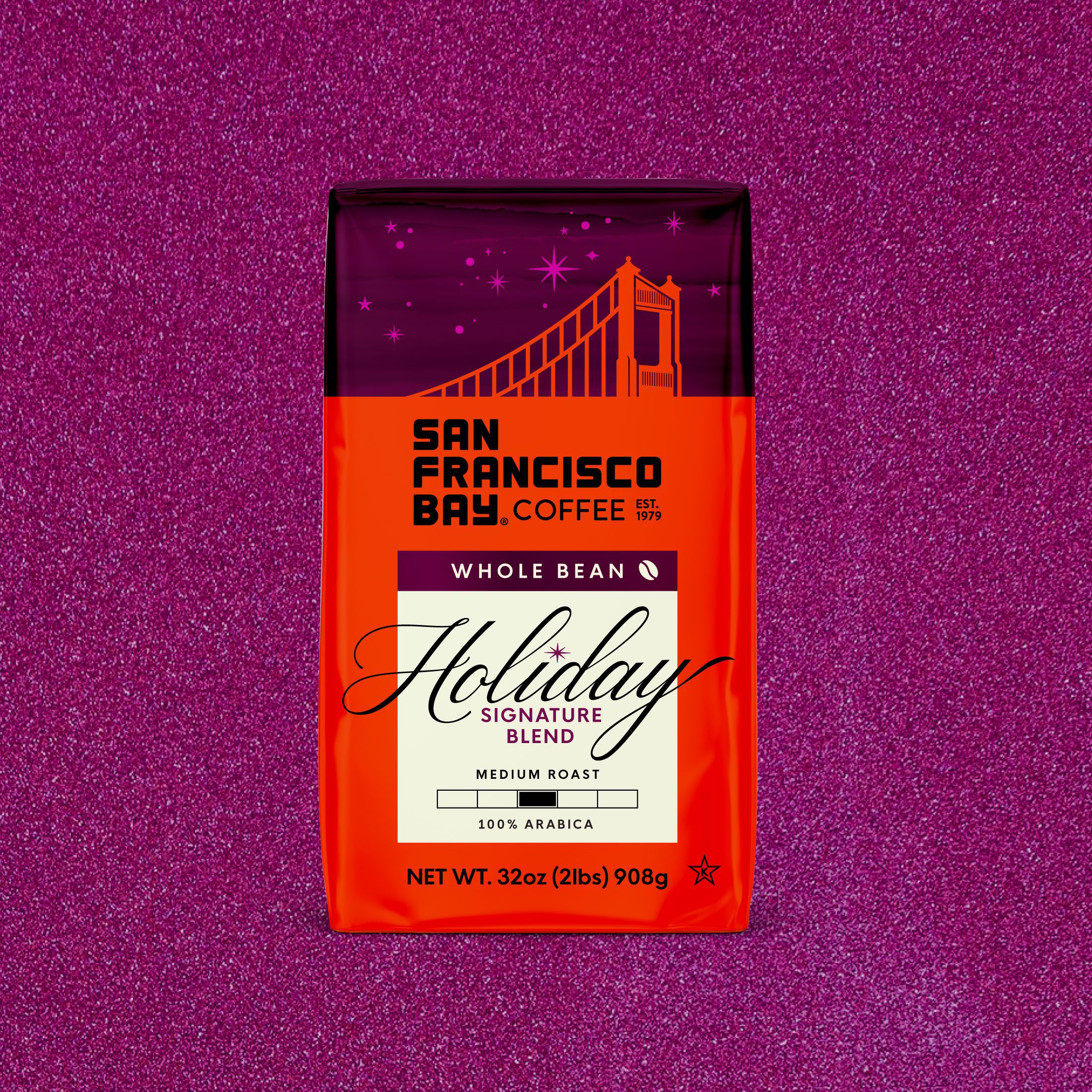
Here, metallic finishes are paired with a rich magenta palette, transforming the familiar San Francisco skyline into something that almost resembles wrapping paper. The deeper, moodier color palette evokes the winter months and creates a sense of seasonality without relying on overtly traditional holiday colors or cues. Tiny stars scattered throughout the skyline add just enough holiday magic while keeping the overall design sophisticated and true to the brand.
Within the cream information panel, “Holiday” becomes the hero. An oversized festive script breaks beyond the border of the box, creating a more expressive moment within the established packaging architecture. Even the dot of the “i” becomes a small star, adding a playful detail that connects back to the night sky.
Together, these subtle shifts make the packaging feel celebratory and giftable while keeping it grounded in the San Francisco Bay Coffee brand.
Knowing What to Keep and What to Change
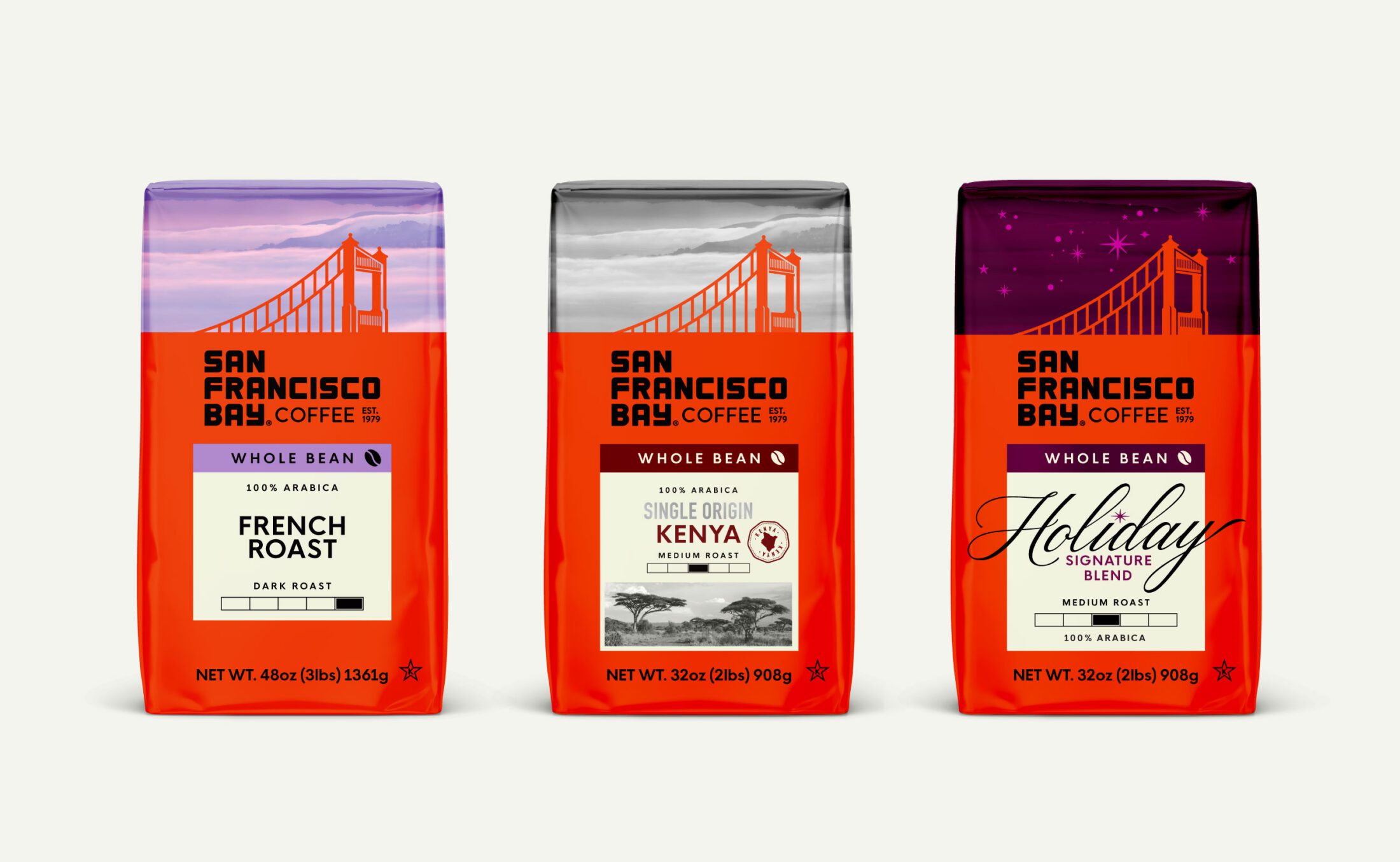
Both extensions demonstrate that creating something new within an existing range doesn’t always require changing everything. In fact, the strongest extensions often come from knowing exactly what not to change.
By maintaining San Francisco Bay Coffee’s most recognizable brand assets and selectively evolving color, finishes, typography, imagery and hierarchy, we were able to give each range a distinct reason for being. Single Origin feels premium and considered. Holiday Blend feels festive and special. Yet place either next to the core range, and the connection is immediate.
That balance is what makes a brand system truly flexible. Keep enough consistency to build recognition, while leaving enough freedom to give consumers something new to discover.