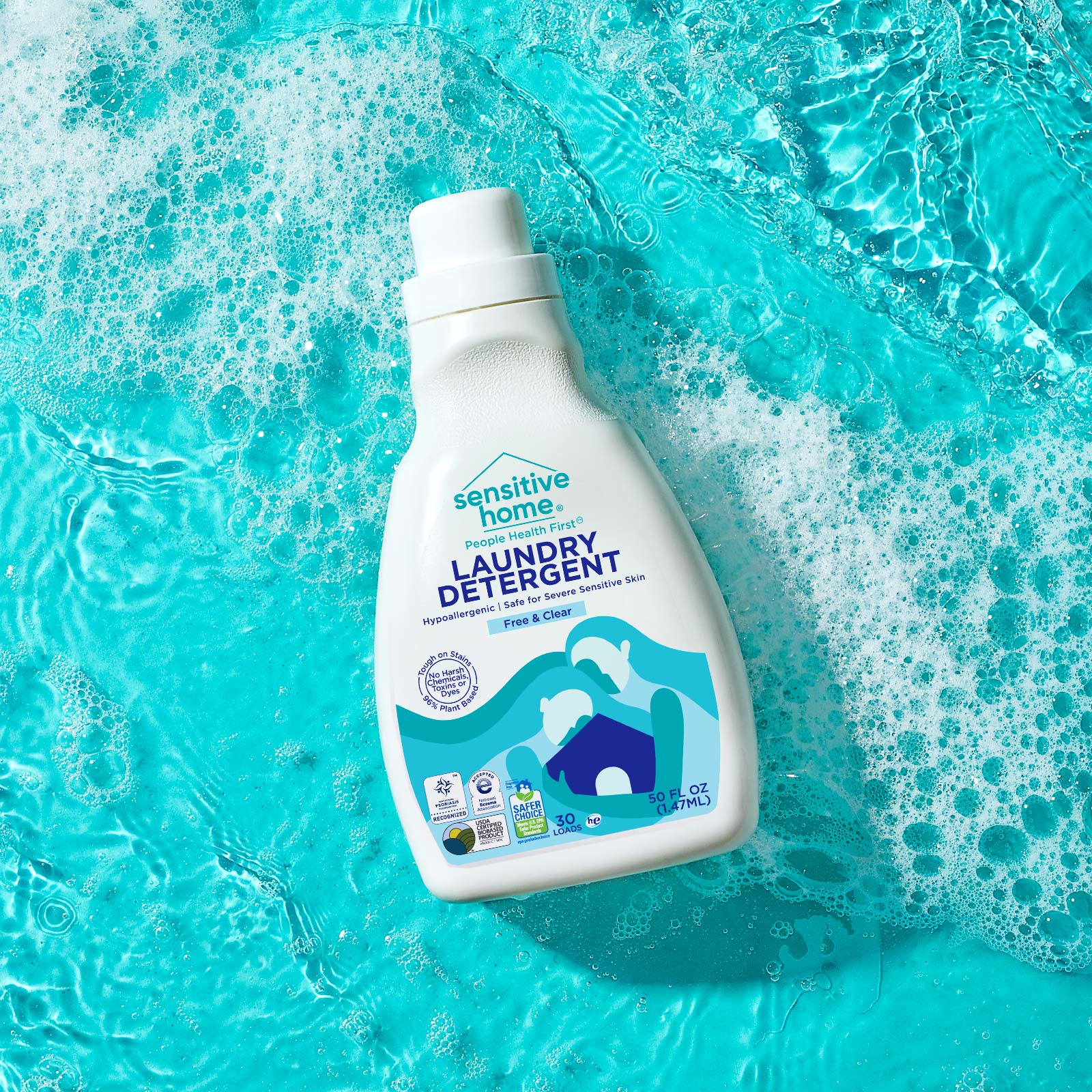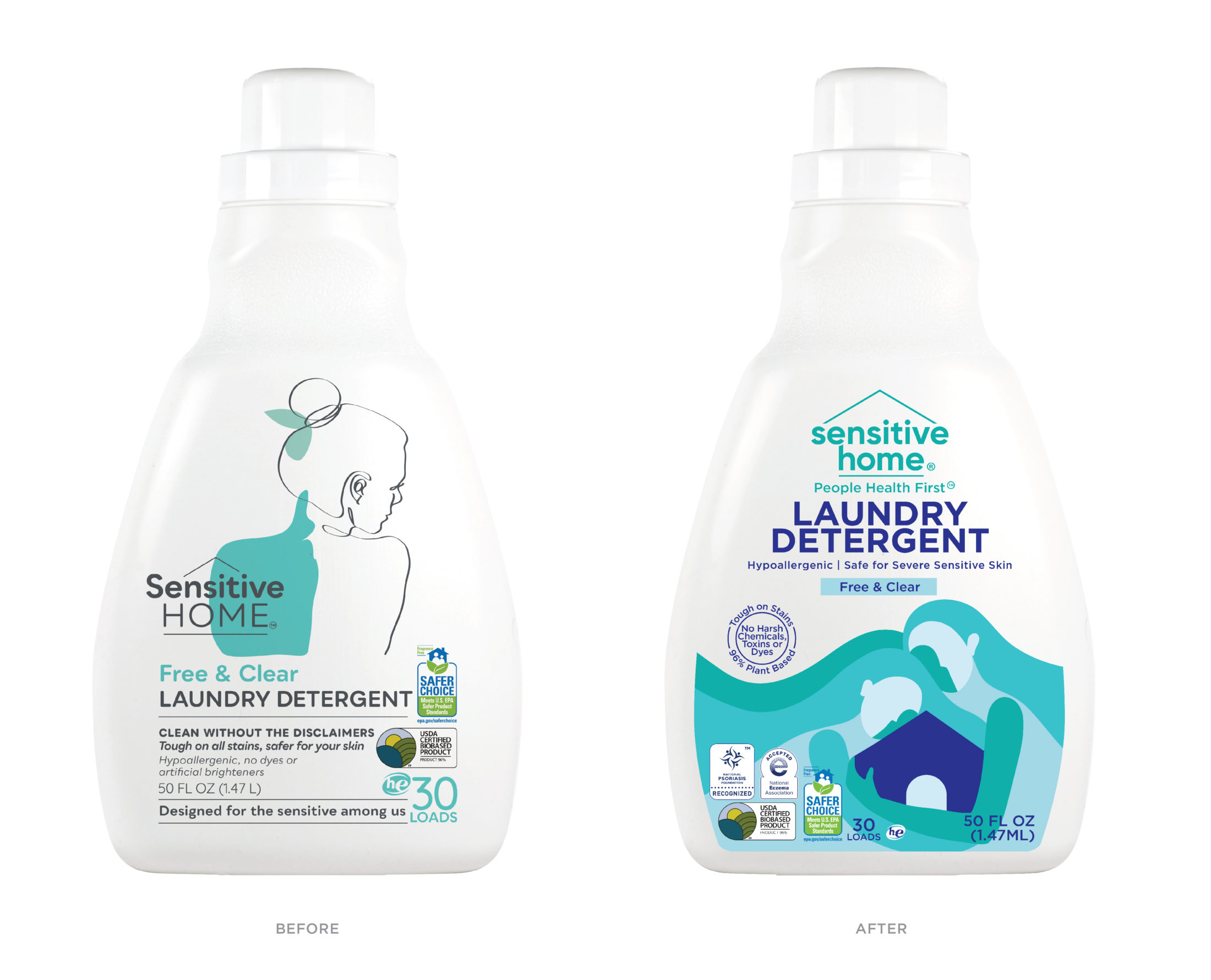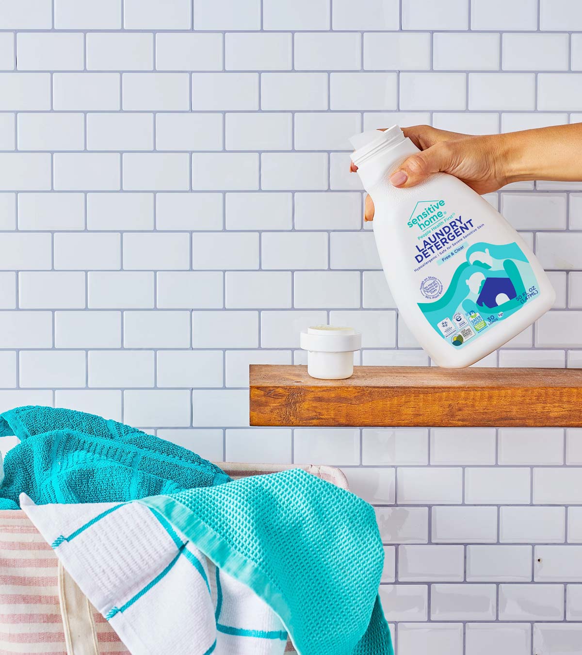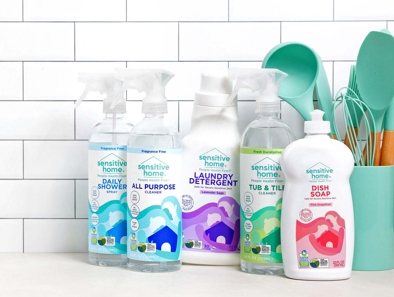
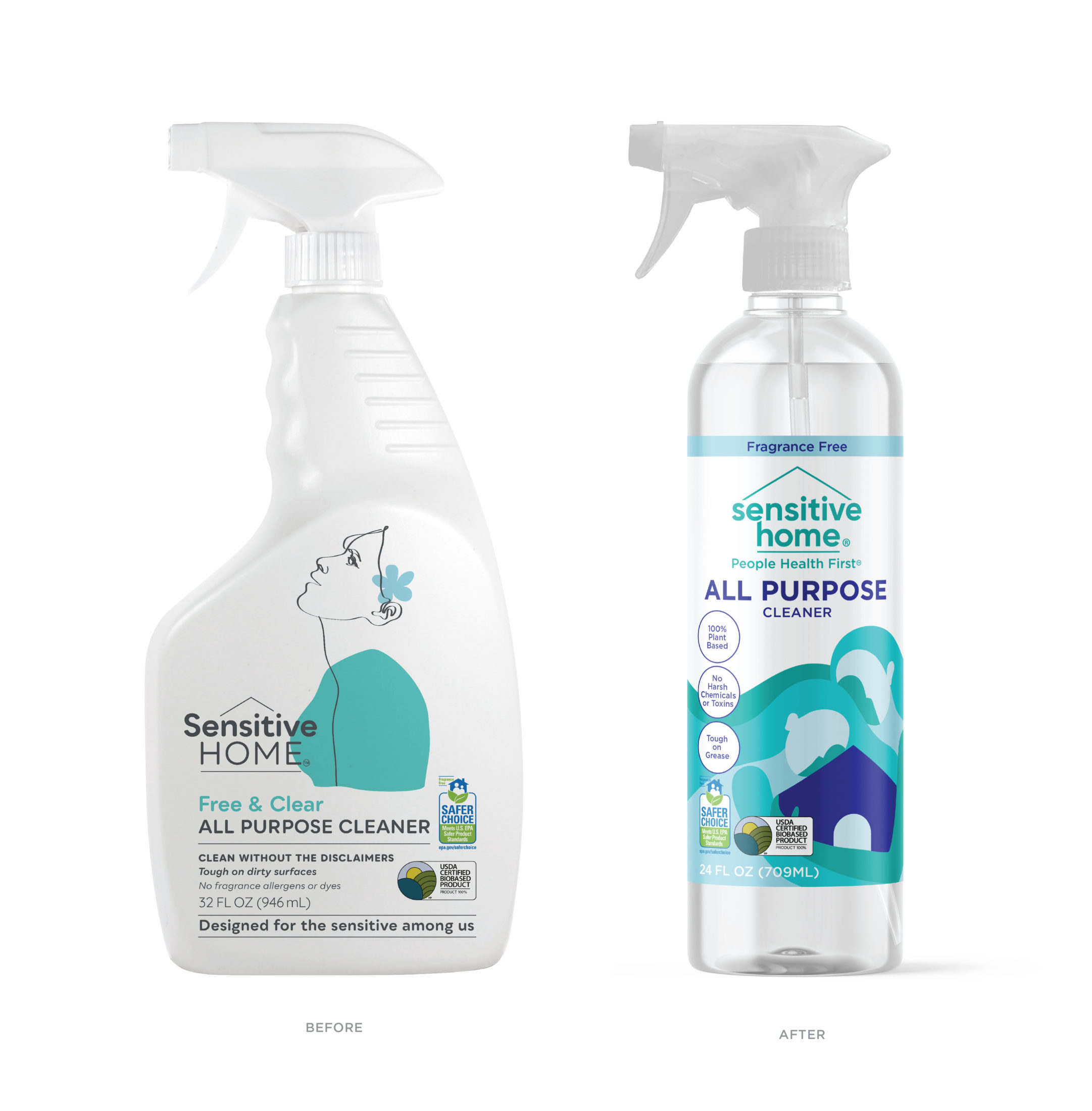
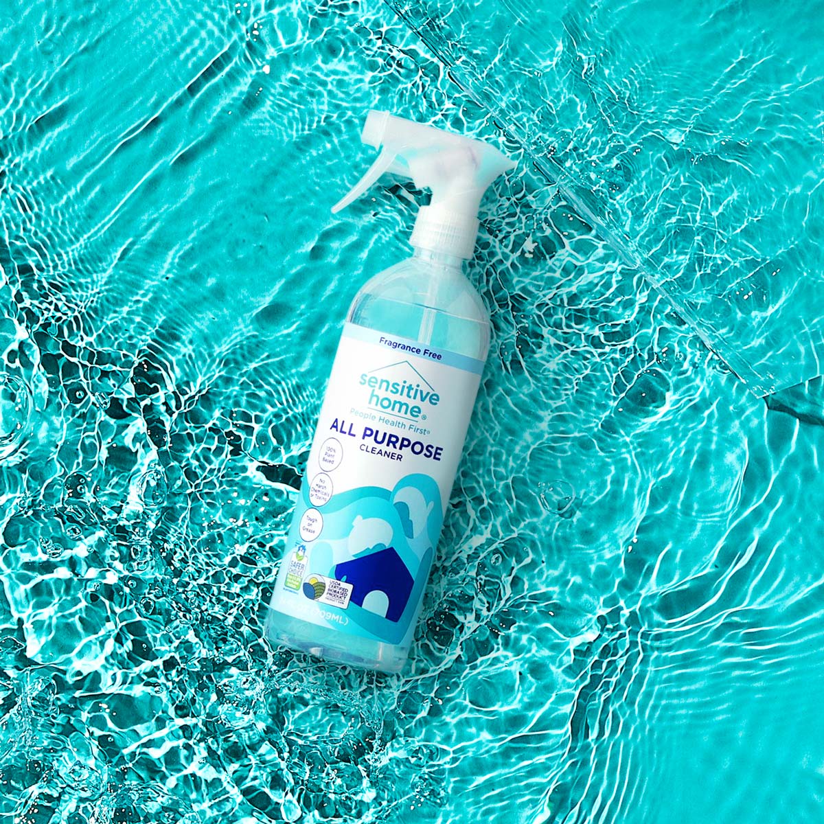
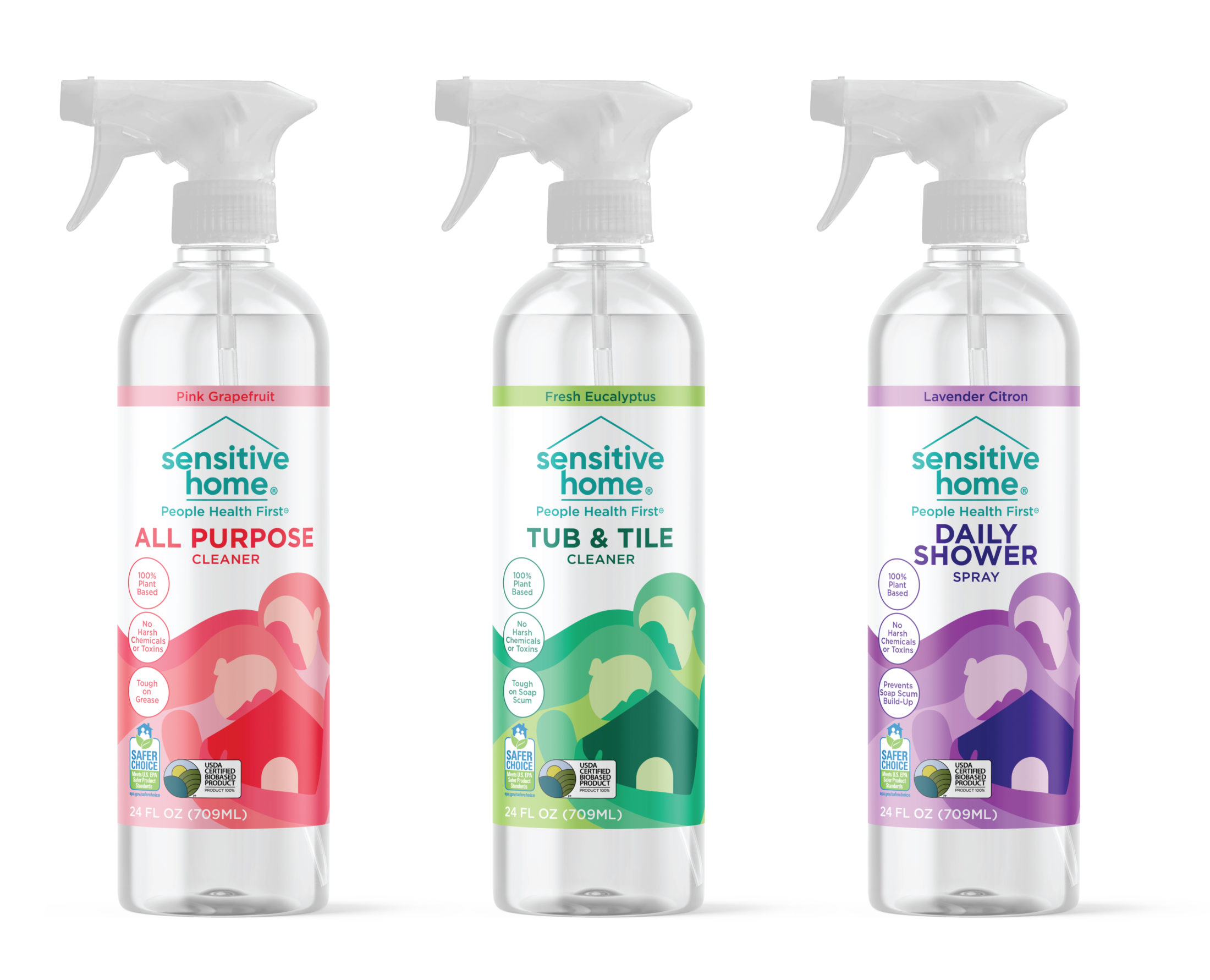
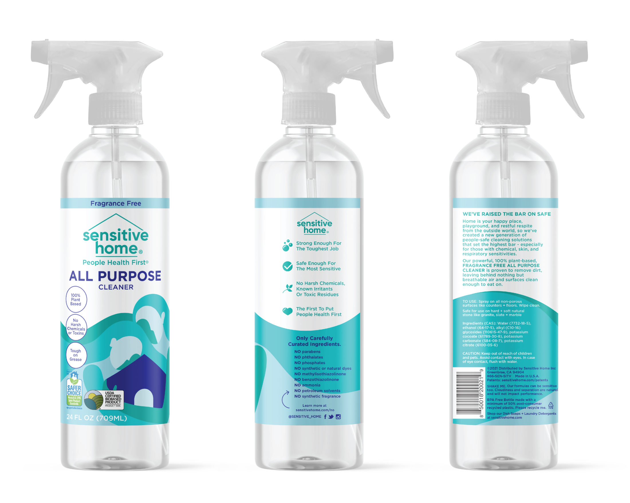
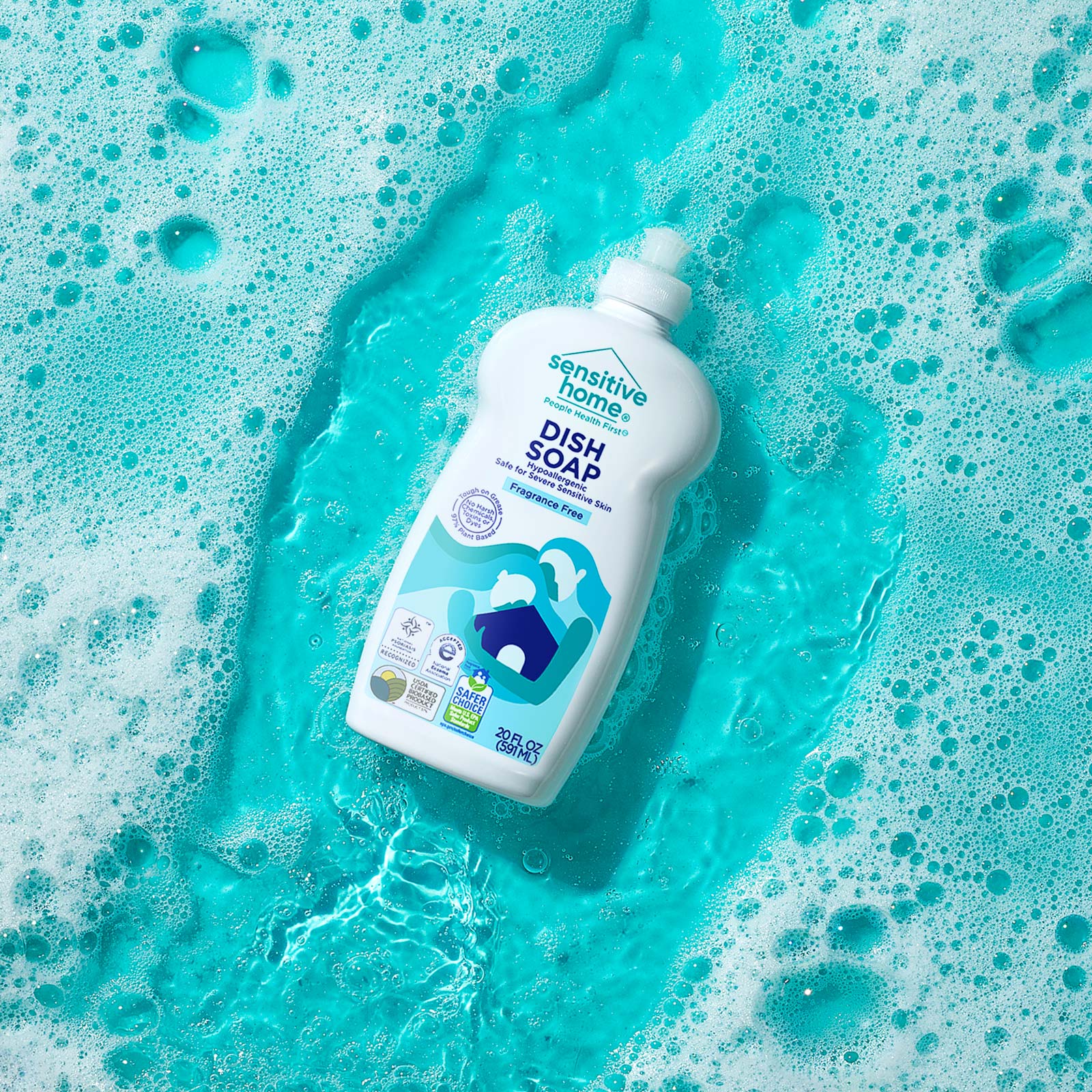
Warm, caring and kind spirited, the Sensitive Home redesign makes one feel like they too are receiving a hug through cleaning products, products made for the safety of ALL people. It is defined by the nurturing illustration of ambiguous, inclusive, fluid human figures that bring both safety and care to the home they are hugging. The vibrant colors lift spirits and adds joyousness. The colors not only make the packaging come to life and stand out on shelf.
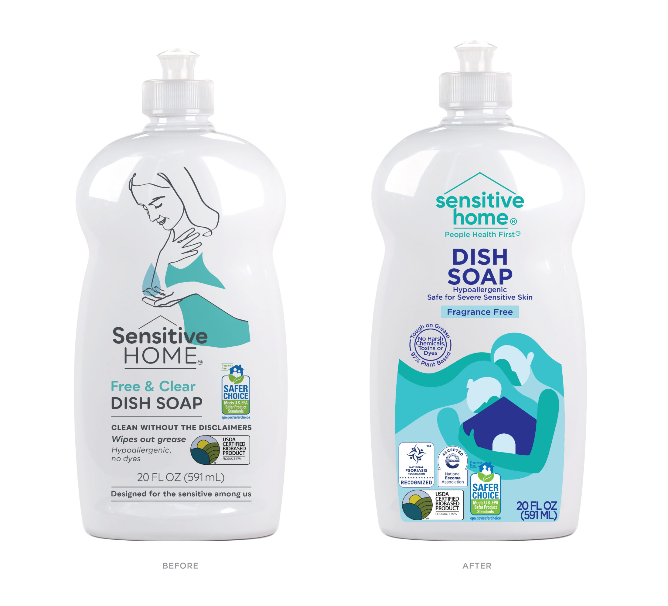
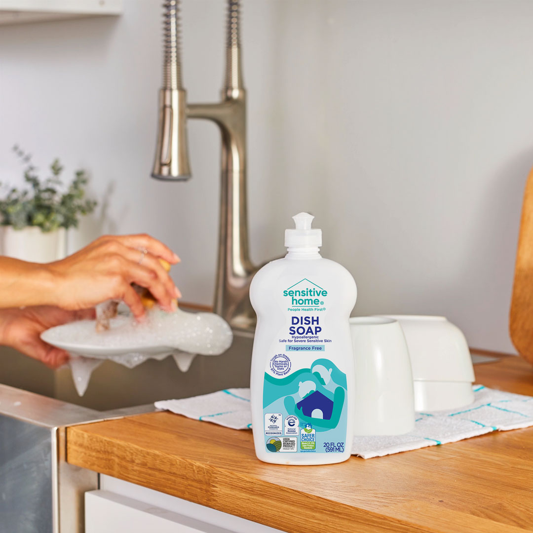
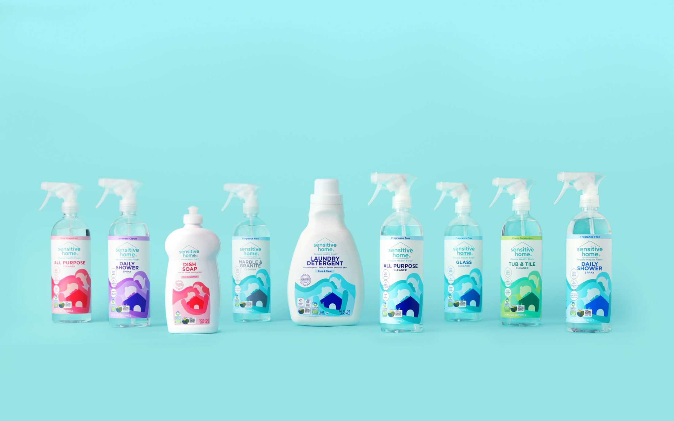
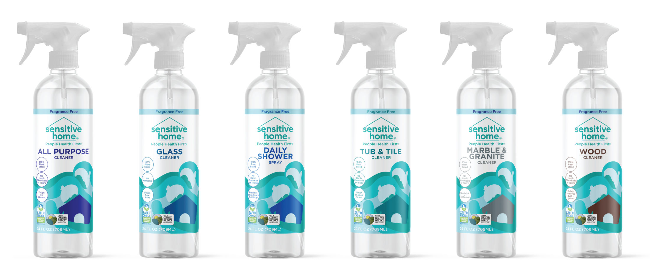
The colors also work as a system. The colors of the human figures define the flavor and the color of the house defines the product usage. The majority of the line, Fragrance Free, is color coded in their Sensitive Home teal that can be seen in the logo on all bottles. Breaking up the beautiful, iconic illustration is circular calls outs stacked on the left panel calling out key attributes and differentiators such as – 100% Plant Based and No Harsh Chemicals and Toxins ever.
Nurturing and inviting the new Sensitive Home design gives one a feeling of comfort, safety and rest while using the products – safe for every person, home and planet.
