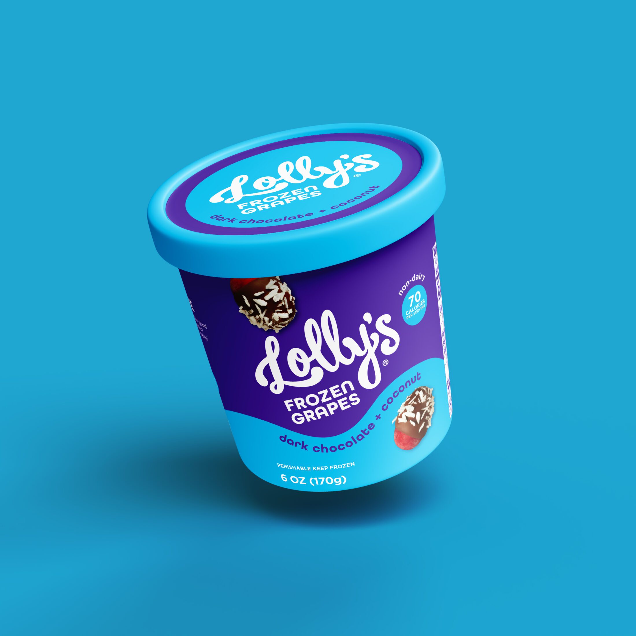
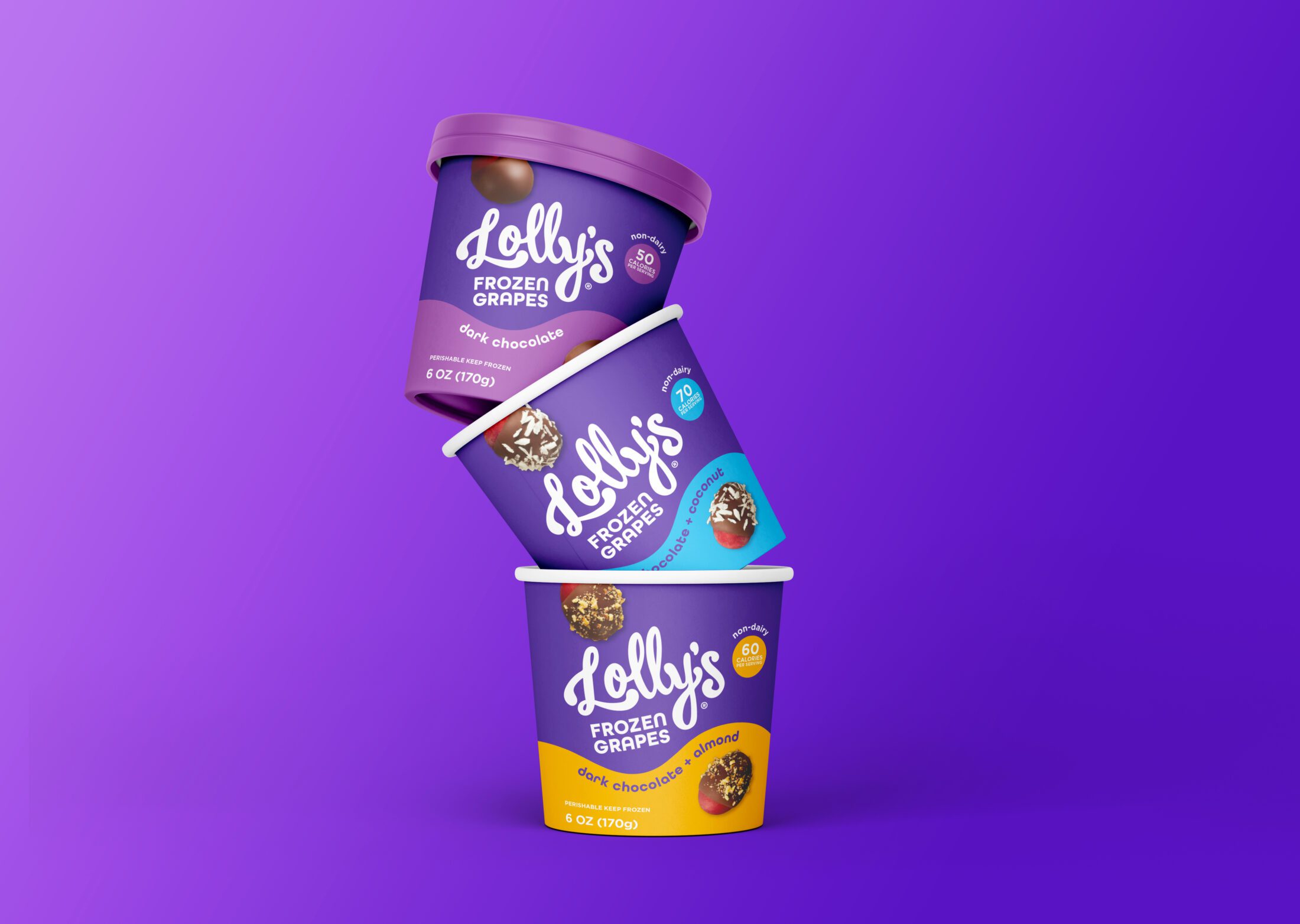
Lolly’s Frozen Grapes got a makeover that’s as juicy as the product itself! We ditched the dull and embraced the bold, transforming this snack-time gem into a freezer aisle icon. From a timid logo to a vibrant world of purple and playful waves, Lolly’s is no longer just a snack – it’s a frozen sensation that demands attention!
Created by two moms with a passion for good food. Lolly’s Frozen Grapes are the perfect bite-sized treats to satisfy your sweet-tooth. An easy snack or dessert, simple ingredients, nothing artificial, and great with wine & cocktails.

We embarked on a journey to infuse Lolly’s with a vibrant personality while preserving its endearing spirit. The logo, once timid, now commands attention with a bold, handwritten flourish. A daring departure from the original brown, our design embraces a captivating purple—a nod to the grape’s essence and a playful wink at the brand’s lighthearted nature. This vibrant hue, coupled with strategic color blocking, creates an irresistable on-shelf presence, shouting “Lolly’s” from across the aisle.


We introduced a dynamic wave that’s as smooth and decadent as the product it represents. This playful element dances across the packaging, harmonizing with the brand’s spirited nature. Flavor-specific color accents within the wave add a delightful touch, further enhancing the package’s visual appeal.


To tantalize taste buds and drive purchase decisions, we showcase mouthwatering images of the product. By artfully revealing the grape enrobed in chocolate, we offer a transparent glimpse into the delightful surprise awaiting consumers.


The result? A brand transformation. Lolly’s is no longer blending in; it’s the star of the freezer aisle. Our design is a bold, confident statement that perfectly captures the brand’s essence and makes Lolly’s Frozen Grapes impossible to ignore.
